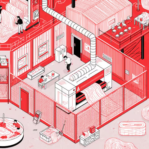
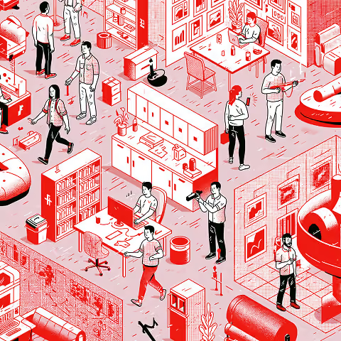
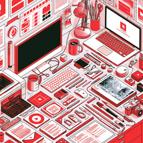
What Are Corporate Graphics in 202 2026?
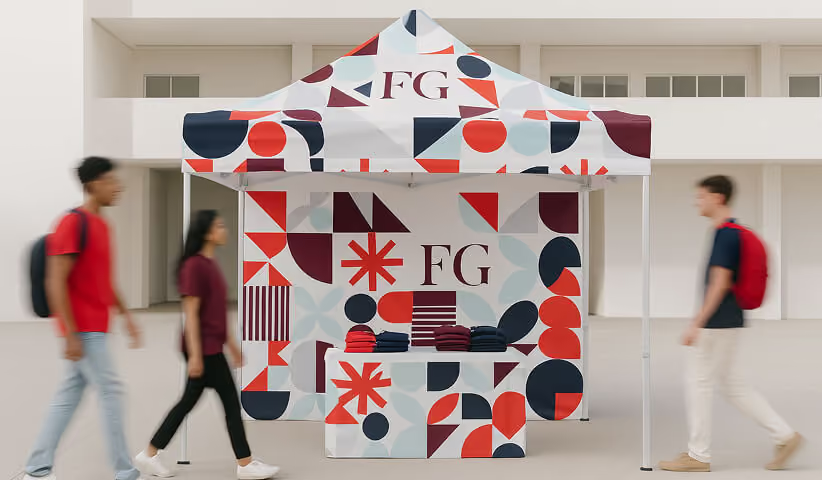
Corporate graphics are the visual assets a company uses to communicate its identity across digital, printed, and physical environments. They include logos, typography, colours, illustrations, presentation templates, packaging, signage, vehicle wraps, trade show displays, office graphics, and other branded materials.
The strongest corporate graphic systems are not simply decorative. They help people recognize the company, understand its message, navigate information, and experience the brand consistently across every touchpoint.
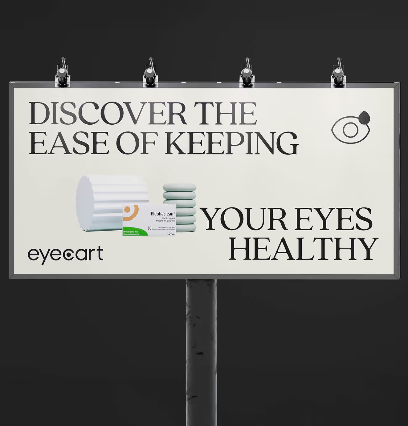
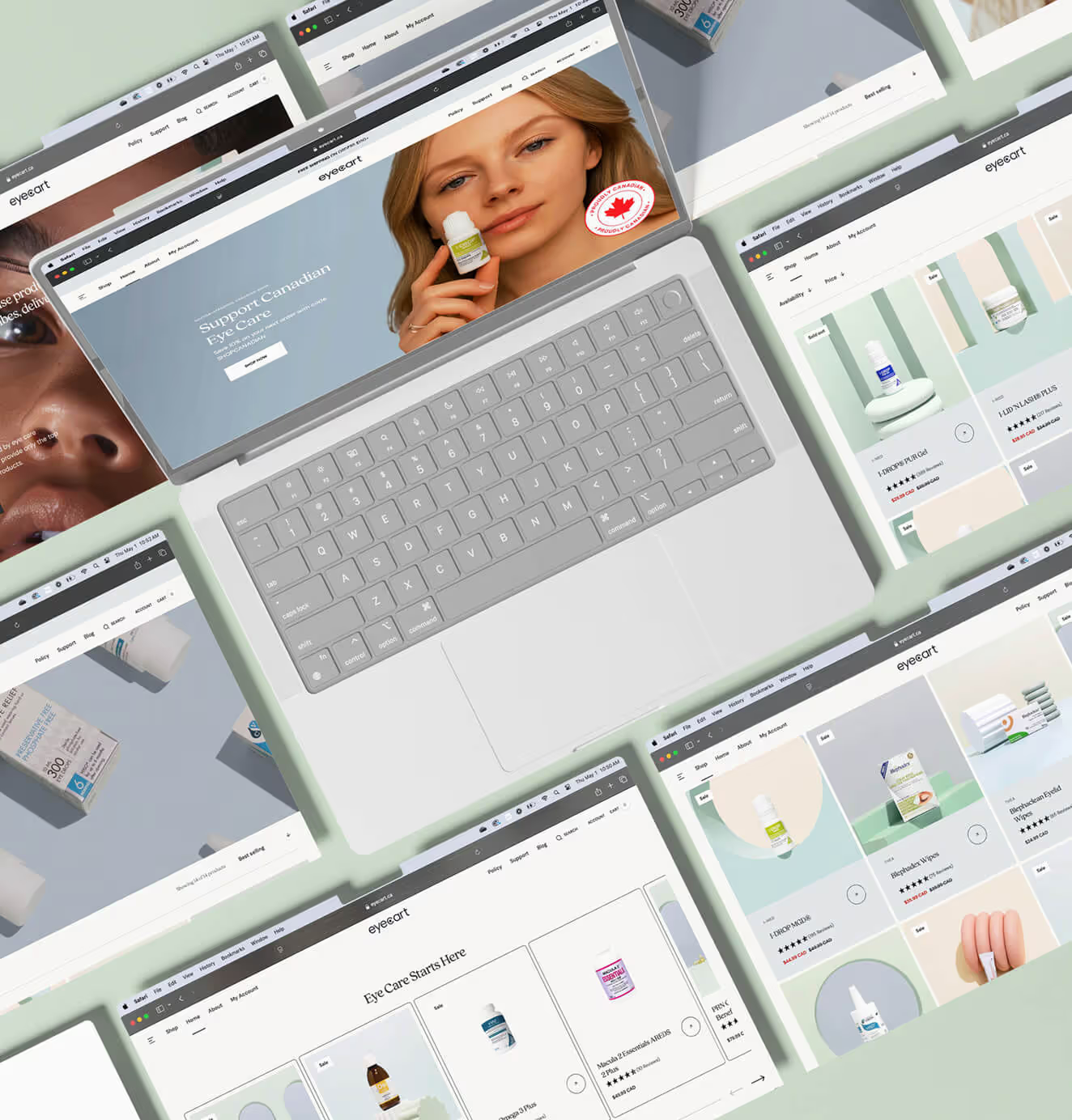
In 2026, corporate graphics must work across more formats than ever. A visual identity may need to appear on a mobile screen, social campaign, sales presentation, retail display, event backdrop, building sign, product package, and vehicle fleet—all without losing its clarity or character.
What Is the Difference Between Corporate Graphic Design and Corporate Graphics?
Corporate graphic design is the process of developing a company’s visual communication system. Corporate graphics are the individual assets produced from that system.
For example:
- A brand identity system is corporate graphic design
- The company logo is a corporate graphic
- A signage system is corporate graphic design
- An individual storefront sign is a corporate graphic
- A presentation system is corporate graphic design
- A specific investor presentation is a corporate graphic
The design system establishes the rules. The graphics apply those rules in real-world situations.
What Types of Corporate Graphics Do Businesses Use?
Corporate graphics generally fall into four categories.
Brand Identity Graphics
These are the foundational elements that make a company recognizable.
They include:
- Logos and brand marks
- Colour palettes
- Typography
- Graphic shapes and patterns
- Illustration systems
- Iconography
- Photography direction
- Brand guidelines
Digital Corporate Graphics
Digital graphics support online communication, marketing, sales, and customer experience.
Examples include:
- Website graphics
- Social media content
- Digital advertising
- Email templates
- Presentation decks
- Infographics
- Product-interface illustrations
- Motion graphics
- Digital sales materials
Printed Corporate Graphics
Printed graphics translate the brand into physical materials.
Examples include:
- Business cards and stationery
- Brochures and reports
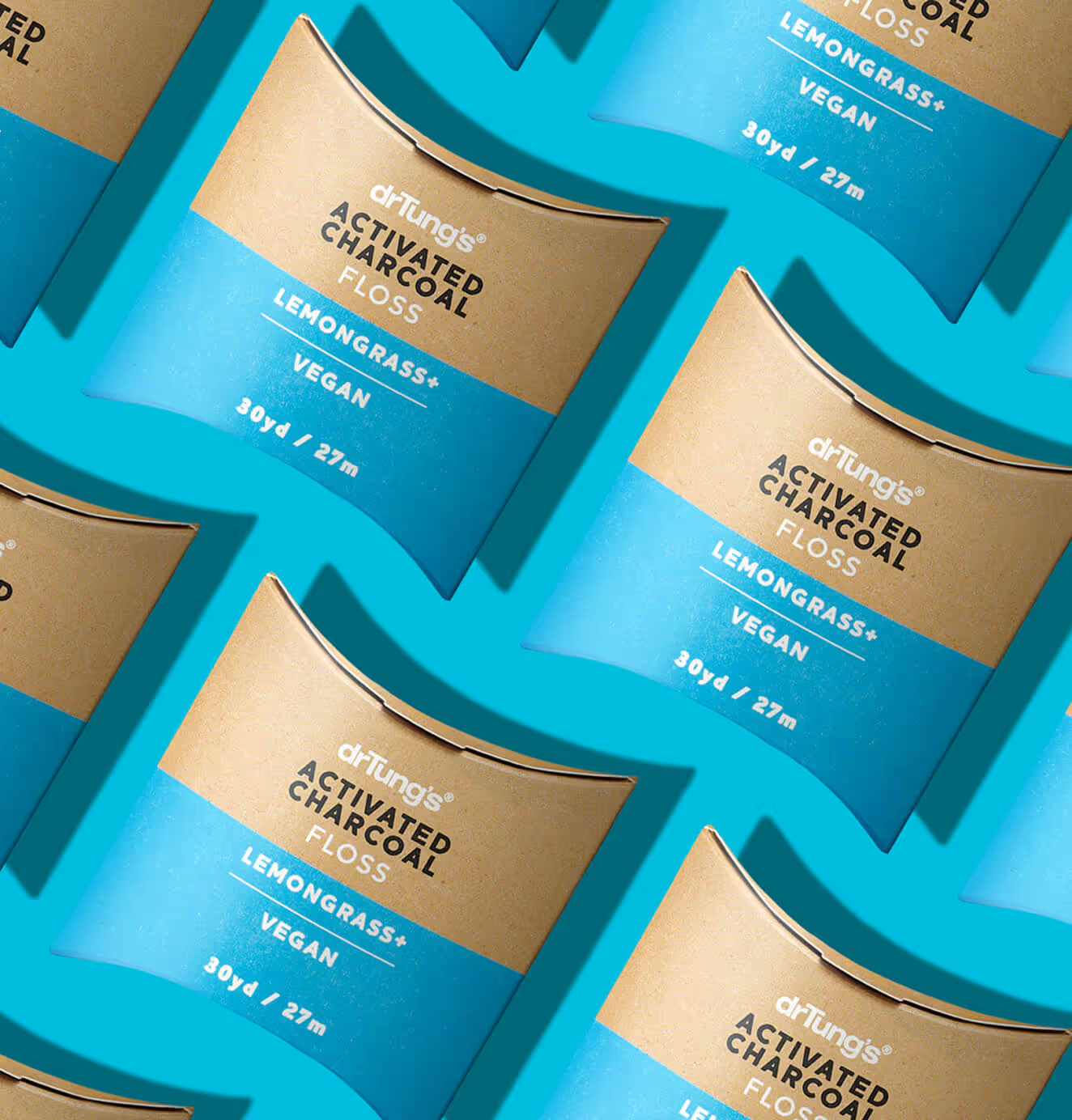
- Product packaging
- Posters and banners
- Direct-mail campaigns
- Sales collateral
- Event materials
- Retail displays
Environmental and Large-Format Graphics
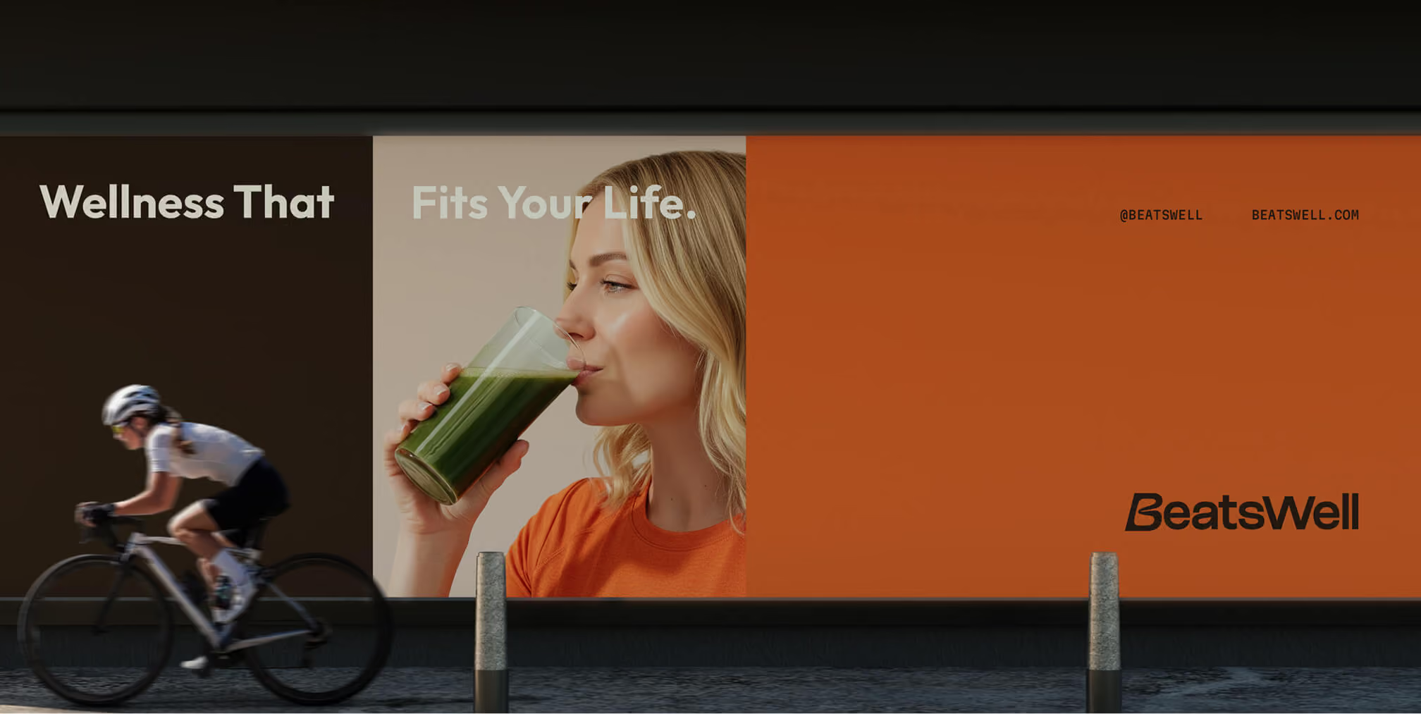
Environmental graphics apply the brand to physical spaces and moving surfaces.
Examples include:
- Building signage
- Office murals
- Window graphics
- Wall coverings
- Wayfinding systems
- Trade show displays
- Vehicle wraps
- Construction hoarding
- Floor graphics
- Experiential installations
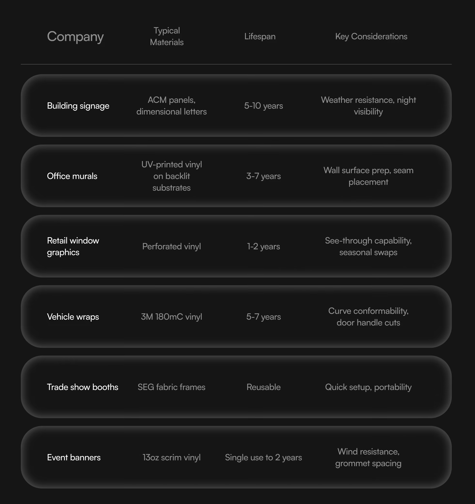
Each application requires the same brand foundation but different production, legibility, material, and viewing-distance considerations.
How Have Corporate Graphics Changed Since 2020?
Between 2020 and 2026, corporate graphics evolved from primarily screen-focused systems into more flexible visual identities designed for both digital and physical environments.
Remote work initially increased demand for websites, virtual presentations, social content, digital campaigns, and product-interface graphics. As hybrid work, in-person events, retail experiences, and experiential marketing returned, companies needed those visual systems to work in offices, stores, conferences, packaging, and public spaces as well.
The result is a more integrated approach. Businesses are no longer choosing between digital branding and printed branding. They need one visual identity that can adapt to both.
This has increased demand for:
- Modular design systems
- Scalable vector artwork
- Flexible illustration libraries
- Motion-ready brand assets
- Large-format environmental graphics
- Consistent digital and print colour systems
- Templates that internal teams can use correctly
- Production guidelines for different materials and vendors
A logo that looks good on a website is no longer enough. The broader system must remain recognizable whether it appears as a small app icon or a building-sized graphic.
Why Do Physical Corporate Graphics Still Matter?
Physical corporate graphics make a brand visible in environments where customers, employees, and partners interact with it directly.
Unlike a digital advertisement that may disappear within seconds, signage, packaging, office graphics, and environmental installations can create repeated exposure over a longer period. They also help companies establish credibility, reinforce culture, improve navigation, and make physical experiences feel intentional.
Commercial printing is particularly valuable for:
- Retail and product launches
- Conferences and trade shows
- Branded workplaces
- Hospitality environments
- Real estate and construction
- Vehicle fleets
- Pop-up experiences
- Packaging and point-of-sale displays
The most effective physical graphics are designed for their surroundings. Viewing distance, lighting, surface texture, installation method, durability, accessibility, and audience movement all affect how the graphic should be created.
What Is Corporate Memphis?
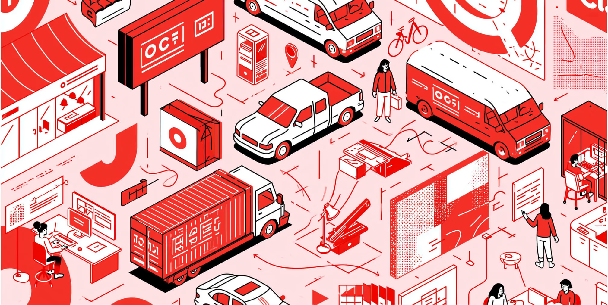
Corporate Memphis is an informal name for a flat, geometric illustration style that became widespread across technology companies, SaaS platforms, financial applications, and corporate websites in the late 2010s and early 2020s.
The style typically features simplified human figures, exaggerated body proportions, minimal facial details, bright colours, geometric forms, and abstract workplace or lifestyle scenes.
It was designed to feel friendly, scalable, and broadly representative. Because the illustrations could be assembled from reusable shapes and characters, companies could apply the style across websites, onboarding screens, product interfaces, advertisements, and internal communications.
Where Did Corporate Memphis Come From?
Corporate Memphis is closely associated with Facebook’s Alegria illustration system.
Facebook approached the design and animation studio BUCK in 2017 to redesign its illustration and animation ecosystem. According to BUCK’s Alegria case study, the resulting system used flat, minimal, geometric shapes, abstract figures, oversized limbs, and non-representational skin colours. BUCK also created a scalable asset library that Facebook could expand over time.
Alegria was not the only example of this visual approach, but its scale and visibility helped popularize similar corporate illustration systems throughout the technology industry.
The term “Corporate Memphis” references the style’s perceived similarities to the Memphis design movement—not a formal continuation of that movement.
The original Memphis group emerged in Milan around Ettore Sottsass in 1980 and publicly debuted its work in 1981. Memphis Milano describes the movement as an expressive challenge to functionalist design, combining bold forms, contrasting materials, decoration, symbolism, and emotional impact.
Corporate Memphis borrows some of that visual vocabulary—particularly geometric shapes, vivid colours, and playful proportions—but applies it within a simplified corporate illustration system.
What Are the Characteristics of Corporate Memphis?
Corporate Memphis illustrations are commonly recognized by:
- Flat vector shapes
- Bright or saturated colours
- Limited shading and realistic depth
- Exaggerated arms, legs, hands, or facial proportions
- Minimal or absent facial features
- Abstract or non-representational skin colours
- Simplified geometric environments
- Friendly workplace or lifestyle scenes
- Reusable characters and objects
- A clean, optimistic visual tone
The style often removes highly specific personal characteristics in an attempt to create figures that can represent a broad audience.
Why Did Companies Adopt Corporate Memphis?
Companies adopted Corporate Memphis because it solved several practical design problems.
It Was Scalable
Vector-based characters and objects could be resized and adapted for websites, applications, presentations, social media, animation, and print.
It Was Systematic
A reusable library allowed internal design teams to create new compositions without commissioning an entirely new illustration for every application.
It Felt Approachable
Rounded forms, playful proportions, and bright colours helped technology and financial products feel less technical or intimidating.
It Supported International Use
Abstract characters and modular scenes could be adapted for different markets, although visual abstraction alone does not guarantee meaningful cultural representation.
It Worked Well in Product Interfaces
The style could add warmth to onboarding screens, empty states, confirmation messages, tooltips, and other moments that might otherwise feel impersonal.
It Was Efficient to Produce
A defined illustration system reduced the time required to create variations, provided the company maintained consistent rules and quality control.
Why Was Corporate Memphis Criticized?
Corporate Memphis was criticized because widespread adoption made many brands look similar.
The same qualities that made the style scalable also made it easy to imitate. As more companies adopted flat figures, exaggerated limbs, abstract skin colours, and geometric scenes, the approach became associated with generic technology branding.
Common criticisms include:
- Limited brand distinctiveness
- Overly simplified human representation
- Generic characters and scenarios
- Repetitive visual conventions
- An overly optimistic corporate tone
- Insufficient cultural specificity
- Weak alignment with certain brand personalities
- Dependence on visual trends rather than brand strategy
A style designed to feel universal can become emotionally distant when it removes too much personality, context, or recognizable human detail.
Is Corporate Memphis Outdated in 2026?
Corporate Memphis is not completely outdated, but using it as a default corporate illustration style can make a brand feel generic or behind current design expectations.
The style still works well for:
- Product onboarding
- Empty states
- Tooltips and help content
- Explainer graphics
- Internal communications
- Secondary website illustrations
- Simple animated interactions
It is less effective when a company needs:
- A highly distinctive brand identity
- Premium or luxury positioning
- Emotional storytelling
- Cultural specificity
- Real-world credibility
- Complex technical communication
- A visual system competitors cannot easily imitate
The question is not whether flat vector illustration is still usable. It is whether the illustration system expresses something recognizable and ownable about the brand.
What Is Replacing Corporate Memphis?
Corporate illustration is becoming more customized, expressive, dimensional, and connected to the rest of the brand identity.
Common approaches include:
- Custom illustration with brand-specific proportions and characters
- Editorial illustration
- Collage and mixed-media compositions
- Hand-drawn textures
- 3D illustration and rendering
- Illustration combined with photography
- Motion-led graphic systems
- Data-driven imagery
- Technical diagrams
- Product-focused visualization
- Tactile graphics designed for print and physical spaces
Rather than selecting a fashionable illustration style and applying brand colours afterward, companies are building illustration systems from their positioning, personality, audience, and visual identity.
How Can a Company Modernize Corporate Memphis?
A company does not necessarily need to discard an existing flat illustration library. It can evolve the system by making it more specific to the brand.
Possible improvements include:
- Introduce distinctive brand shapes or patterns
- Use a proprietary colour relationship rather than trend-driven colours
- Develop recognizable character proportions
- Add meaningful facial expressions and gestures
- Represent real customer environments
- Include products, tools, or category-specific details
- Combine illustration with photography or 3D elements
- Add texture, depth, motion, or lighting
- Create clearer rules for cultural representation
- Extend the illustration system into print and environmental design
The goal is to move from a generic aesthetic to a recognizable visual language.
How Do Corporate Graphics Move From Digital Design to Commercial Printing?
Preparing corporate graphics for commercial printing requires more than enlarging a digital file. Printed graphics must be adapted for colour reproduction, scale, materials, finishing, installation, and viewing conditions.
A professional print workflow should address the following areas.
Vector Artwork
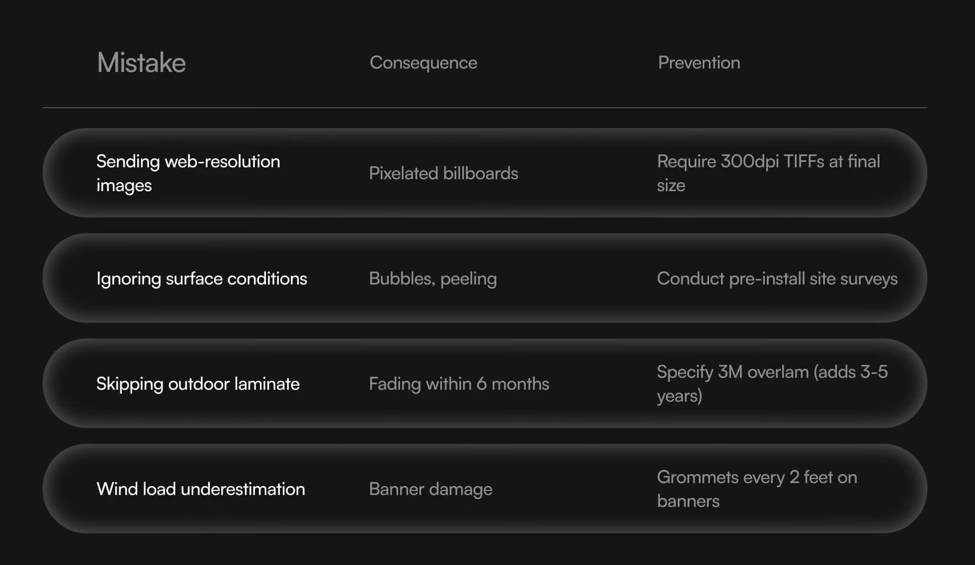
Logos, icons, typography, and flat illustrations should be supplied as vector artwork whenever possible. Vector files can be scaled for signage, trade show displays, vehicle wraps, and wall graphics without losing sharpness.
Colour Specifications
Digital graphics typically use RGB colour, while most commercial-print applications use CMYK, process colours, or spot colours.
The brand guidelines should define approved colour values for digital and print production. A physical proof may be necessary when accurate brand-colour reproduction is critical.
Image Resolution
Photographic images must have sufficient effective resolution at the final output size. Large-format requirements vary according to the printing method and expected viewing distance, so the production file should follow the printer’s specifications rather than a single universal resolution rule.
Bleed and Safe Areas
Artwork that extends to the edge of a printed piece requires bleed beyond the final trim line. Important text, logos, and other content should remain inside an appropriate safe area.
Adobe’s print-bleed guidance explains that artwork must extend beyond the final trim size so the printed design reaches the edge after cutting. The exact bleed should always be confirmed with the print provider.
Fonts and Linked Assets
Fonts should be packaged, embedded, or outlined according to the printer’s requirements. Linked photographs, illustrations, and graphics must be included at their full production quality.
File Format
Many commercial printers request a print-ready PDF using a specific PDF preset or PDF/X standard. Vehicle graphics, signage, packaging, and specialty production may require additional working files, dielines, spot-colour separations, or finishing layers.
Materials and Finishes
The design should account for:
- Indoor or outdoor use
- Surface texture
- Weather and UV exposure
- Expected lifespan
- Installation method
- Lamination
- Reflective or translucent materials
- Specialty inks
- Cutting and fabrication
- Sustainability requirements
A graphic that works on coated paper may reproduce differently on fabric, vinyl, glass, corrugated board, metal, or an illuminated sign.
Proofing and Production Testing
Colour proofs, material samples, scaled mockups, and test installations help identify issues before full production. For large-format work, teams should also review the design from the intended viewing distance.
What Makes a Corporate Graphic System Effective?
An effective corporate graphic system is recognizable, flexible, accessible, and production-ready.
It should:
- Express the company’s positioning and personality
- Remain consistent across digital and physical channels
- Be distinctive from competitors
- Scale from small interfaces to large environments
- Support clear information hierarchy
- Maintain legibility and accessibility
- Include rules for photography, illustration, icons, and motion
- Define digital and print colour values
- Provide templates for recurring applications
- Include production guidance for external vendors
- Give internal teams enough flexibility to work efficiently
Consistency does not mean making every application identical. It means creating a coherent system that can adapt without losing the brand’s identity.
How Should Businesses Approach Corporate Graphics in 2026?
Businesses should treat corporate graphics as a connected brand system rather than a collection of isolated design assets.
Start with a clear brand strategy and visual identity. Then determine how the system needs to perform across websites, campaigns, presentations, products, packaging, offices, retail environments, events, and commercial printing.
Trends such as Corporate Memphis can provide useful visual references, but they should not replace strategic decision-making. The strongest corporate graphics are not merely current. They are recognizable, purposeful, adaptable, and specific to the organization they represent.
When digital assets and physical applications are designed as one system, the brand becomes easier to recognize, easier to manage, and more consistent wherever people encounter it.


.png)