Design System vs Style Guide: What's the Difference?
10/27/2026
Design
Learn the difference between a design system and a style guide to strengthen brand consistency, streamline workflows, and scale your business efficiently.
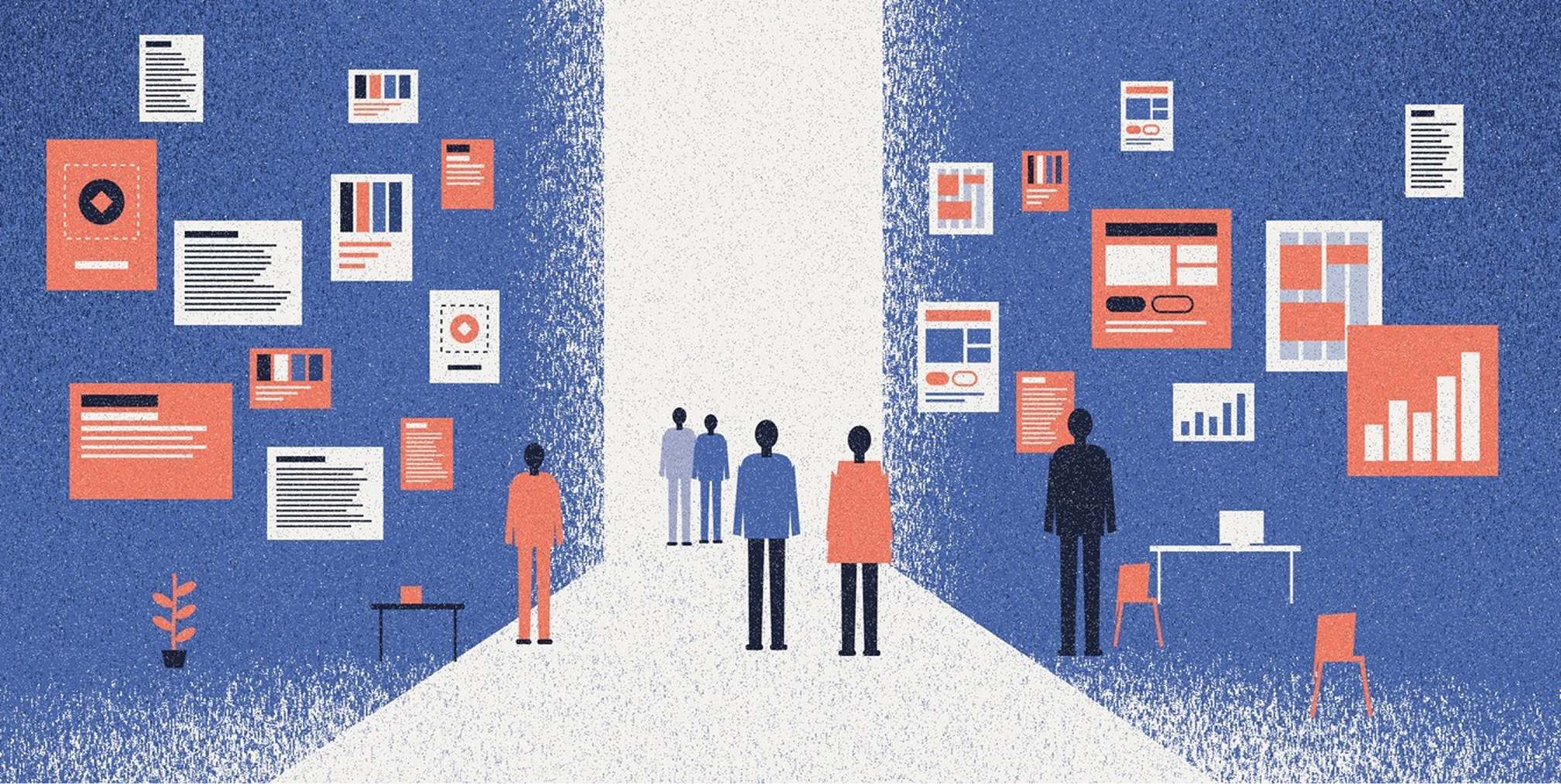
A style guide documents the rules for how a brand looks and sounds: colors, typography, logos, voice. A design system is bigger and operational: it holds those rules plus reusable components, patterns, code, documentation and the people who govern it all. Most of the time the style guide lives inside the design system. The real question for a growing company is which one you need now, and when to graduate to the other.


The short answer: one is a document, the other is a system


Nielsen Norman Group describes a design system as a complete set of standards for managing design at scale, built on reusable components and patterns. A style guide, in the same framing, is a narrower piece within that system.
That narrowness is the whole distinction. A style guide tells people what is correct. A design system also gives them the parts to build with, the rules for when to use each part, and a process for changing them.
Style guide vs design system at a glance
- Scope: A style guide sets visual, content, brand or interaction rules. A design system brings principles, foundations, components, patterns, code and governance together.
- Who uses it: A style guide supports designers, writers, marketers and agency partners. A design system also serves product teams, engineers and anyone creating digital experiences.
- Format: A style guide is often a document or reference page. A design system is a living library of guidance and assets, often connected to production code.
- Maintenance: Brand style guides generally need updates when the brand changes. Design systems need continuing ownership, versioning and improvements as products evolve.
- Best fit: Choose a style guide to align brand expression. Choose a design system to improve consistency and speed across repeated digital work.
What a style guide actually covers
NN/g defines a style guide as focused documentation with specific implementation guidelines, visual references and design principles for content, brand or visual design. Its job is to create a cohesive experience by enforcing consistency in specific aspects of it.
In practice, style guides come in several flavors:
- Brand style guide: Covers approved logos and variations, clear space, color palettes, typography, imagery and visual examples. It can also point teams to broader positioning and brand messaging rules.
- Content style guide: Documents voice and tone, terminology, grammar, capitalization, punctuation, inclusive language and formatting. It helps marketing, support and product copy sound like one organization.
- Front-end or visual style guide: Explains interface-level choices such as grids, spacing, type scales, product colors and interaction principles. It may show example UI elements without providing a complete, maintained component library.
A company may need more than one of these guides. What matters is that each one removes ambiguity for the people producing work.
If you want the brand version in depth, we break it down in our overview of what brand guidelines are and in our guide to visual brand guidelines.
What a design system includes
A design system, per the Interaction Design Foundation, is a set of standards for managing and scaling design. It typically includes reusable components, principles and guidelines, approved colors and fonts, interaction and content guidance, accessibility guidelines, design tokens and code.
Forrester Consulting, in research published by Adobe, names five elements of an effective design system: design principles, foundations, components, guidelines and resources. The same source makes a pointed observation: a brand style guide and a reusable component library alone do not make a full system.
Foundations
Foundations are the base layer. Figma lists color, typography, icons, logos, illustrations, voice and tone, accessibility guidance and brand guidelines as common foundations. This is where the style guide lives.
Components and patterns
NN/g explains that component libraries document reusable UI elements with names, descriptions, attributes, states and code snippets. Figma separates these from pattern libraries: components are things like buttons and inputs, while patterns address broader solutions such as navigation flows and data display.
Tokens
Design tokens turn visual decisions into shared references. The U.S. Department of Veterans Affairs explains that tokens for color, spacing, typography and shadows let teams change a value centrally and apply it consistently. Change the brand blue once, and every button, link and banner can follow when those elements use the shared token.
People and governance
NN/g’s view is that a design system is not only a repository. The people who maintain and govern it are one of its two essential parts. Adobe’s guide makes a similar point, saying a system should be treated like a product that serves the main product, not a single static file.
Free Brand Health Audit
Make sure your brand is built to sell
Search has changed. Your customers aren't just Googling anymore. They're asking ChatGPT, Perplexity, Gemini and other AI platforms what to buy, who to trust and which brands they should consider.
If your brand isn't showing up clearly in those answers, you're already losing opportunities. Our free Brand Health Audit shows you where your brand stands across traditional search, AI search and brand positioning.

Sample brand audit
Live preview
Traditional search
72
AI search (GEO)
34
Brand positioning
58
Where brand guidelines fit

Searchers often ask about brand guidelines vs a design system, and the confusion is understandable. NN/g notes there is substantial overlap because both can contain brand-related elements. A brand style guide specifies logo use, color palette and typography. A front-end style guide adds the interface pieces.
The difference is mostly about who consults it and what for. ZoCo Design says brand guides are primarily consulted for visual and verbal consistency, such as correct colors, fonts and language, often in marketing. Design systems document digital design decisions for products and experiences. It also characterizes brand guides as more static and tied to brand creation or a rebrand, while design systems are iterative: they start small and evolve with the product.
A useful mental picture:
- Brand guidelines establish the identity: the logo, colors, typography, imagery, language and principles that make work recognizably yours.
- Design-system foundations translate that identity into reusable rules: for example, accessible color combinations, type scales, spacing values and tokens for digital interfaces.
- Components, patterns and governance make those rules repeatable: teams can reuse a tested button, form or navigation pattern, and know how updates are approved and rolled out.
This layering matches NN/g’s conclusion that these resources are parts of one system rather than mutually exclusive alternatives.
Which one does your company need?
Choose by the problem you have, not by the trendier name. That is the practical advice from ZoCo Design: use a brand guide for brand consistency and a design system for product-level component, pattern and interaction decisions.
Start with brand guidelines if…
- Your logo, typography, color palette or messaging is being applied differently by employees, freelancers or outside agencies.
- Your main output is marketing collateral, social content, packaging, presentations or a relatively simple website.
- New hires and partners regularly ask for basic rules, approved files or examples of what is on-brand.
- You need one dependable reference before investing in a larger set of design and development tools.
Figma’s cited Brand Studio expert Leandro Castelao says teams need a brand style guide very early, can start a first version once they have a few brand assets, and should evolve it as the brand and customers change. NN/g adds that a brand style guide generally needs little maintenance once created.
Invest in a design system if…
- Multiple designers or developers are building the same interface elements in different ways.
- Your website, app or product suite has repeated patterns that need to work across many pages or screens.
- Design-to-development handoff slows down because states, spacing, behavior or accessibility requirements are unclear.
- You have enough ongoing product work and ownership capacity to maintain shared components, documentation and releases.
The payoff is speed. The Design Systems Handbook says that with reusable components guided by clear standards, reuse makes scale possible and helps teams build products faster. NN/g similarly says design systems reduce redundant work by providing a shared source of truth for what components are and when to use them.
The same discipline matters for consumer brands moving from early traction to larger volume. The more channels and people you add, the more a shared set of rules and parts pays off.
Want to learn more about brand platforms, Brand Strategy and Brand Identity? Keep reading!
If you need help with your companies brand strategy and identity, contact us for a free custom quote.
How the two work together over time
Most companies do not choose once. They sequence.
- Define the brand: Set positioning, visual identity, voice and the core rules that will keep customer-facing work consistent.
- Document repeatable decisions: Turn those brand guidelines into practical references for teams building websites, campaigns and digital products.
- Audit the existing interface: Find duplicated buttons, inconsistent spacing, conflicting page patterns and accessibility gaps before making a component library.
- Build a focused first system: Create tokens and a small set of high-use components with clear names, states, usage guidelines and code where relevant. Start with the pieces teams need most.
- Give the system an owner and a feedback loop: Agree on contributions, approvals, updates, deprecations and team training. Measure whether people actually reuse the system rather than working around it.
Adobe’s guidance on implementation and adoption stresses collaboration between designers and engineers, along with migration guides, documentation, education and support to drive adoption. Adoption, not creation, is where most systems succeed or stall.
Common mistakes
- Calling a PDF a design system. A logo page and a color palette are a style guide. That is valuable, but it is not a system.
- Building the system before the brand is settled. Tokens and components encode decisions. If positioning is still moving, you will rebuild them.
- Skipping voice. Visual rules without tone guidance produce a site that looks right and sounds like five different companies. See our guides to brand tone and voice guidelines.
- No owner. The system needs someone who approves changes, retires old components and trains new people.
- Ignoring accessibility. Accessibility guidance belongs in the foundations. Systems such as the VA Design System document accessible patterns alongside visual and technical decisions.
Perspective: build the brand first, then make it perform
We see the same pattern in growth-stage companies. A brand gets defined, a style guide gets written, and then the website, paid media, email and SMS programs each interpret it a little differently. Nothing is wrong with any single asset. The inconsistency shows up in the sum, and it costs trust and conversion.
Our view is that the style guide and the design system should not be separate projects owned by separate teams. The style guide captures what the brand stands for. The system makes that identity easy to apply on every page, in every campaign and in every inbox. That is what we mean by brand-backed performance: positioning, creative and digital platforms working as one measurable growth system.
So we advise executives to ask two questions. Is our brand defined clearly enough that anyone can apply it? And can our teams ship new pages and campaigns without reinventing the basics? If the first answer is no, start with brand guidelines. If the second is no, you are ready for a system.
How we help
We work with growth-stage companies on both layers. On the brand side, our branding service covers positioning and brand guidelines. On the build side, our team handles strategic website development, including Shopify and Webflow builds, so the identity you define is the identity customers experience. Creative Services start from $4,000 per month and Growth Strategy from $8,500 per month. Branding and web projects are scoped individually. See the full list on our pricing page, or talk to our team about where you are today.
Frequently Asked Questions
Is a style guide part of a design system?
Usually, yes. NN/g describes the style guide as a narrower piece within a design system, alongside component and pattern libraries. A style guide can also exist on its own, which is common for companies that need brand consistency but are not building complex digital products.
Are brand guidelines the same as a design system?
No. Brand guidelines define elements such as color, typography, logos, imagery and voice. A design system can include them, but adds reusable components, patterns, code and governance. Brand guidelines answer “how should this look and sound?” while a design system also answers “what do we build it with?”
What is the main purpose of a style guide?
A style guide establishes a cohesive experience by enforcing consistency in specific aspects of it, such as visuals, writing or interface rules. It gives designers, writers and outside partners one shared reference, so they do not each make their own decisions.
When should a startup build a design system?
Once you expect years of repeated design and development work and several people are building the same elements. Before that point, a clear brand style guide is usually enough. Many teams begin with a small set of components and tokens and grow it from there.
Sources
- Nielsen Norman Group — Design Systems vs. Style Guides
- Nielsen Norman Group — Design Systems 101
- Interaction Design Foundation — Design Systems
- Forrester / Adobe — Best Practices to Scale Design With Design Systems
- Forrester — Get Your Design System Right: Approach It Like a Product
- VA Design System — Design Tokens
- Adobe Design — Designing Design Systems: Supporting Implementation and Adoption
- The Branded Agency — What Are Brand Guidelines?
- The Branded Agency — Visual Brand Guidelines
- The Branded Agency — Brand Voice Guidelines

Quincy Samycia
As entrepreneurs, they’ve built and scaled their own ventures from zero to millions. They’ve been in the trenches, navigating the chaos of high-growth phases, making the hard calls, and learning firsthand what actually moves the needle. That’s what makes us different—we don’t just “consult,” we know what it takes because we’ve done it ourselves.
Want to learn more about brand platform?
If you need help with your companies brand strategy and identity, contact us for a free custom quote.
We do great work. And get great results.
+2.3xIncrease in revenue YoY
+126%Increase in repurchase rate YoY



+93%Revenue growth in first 90 days
+144% Increase in attributed revenue




+91%Increase in conversion rate
+46%Increase in AOV


+200%Increase in conversion rate
+688%Increase in attributed revenue