The Five Second Test: How to Run One and Read the Results
11/17/2026
Web Design
Find out whether your homepage, landing page or ad makes the right first impression before you spend more on traffic, design or production.
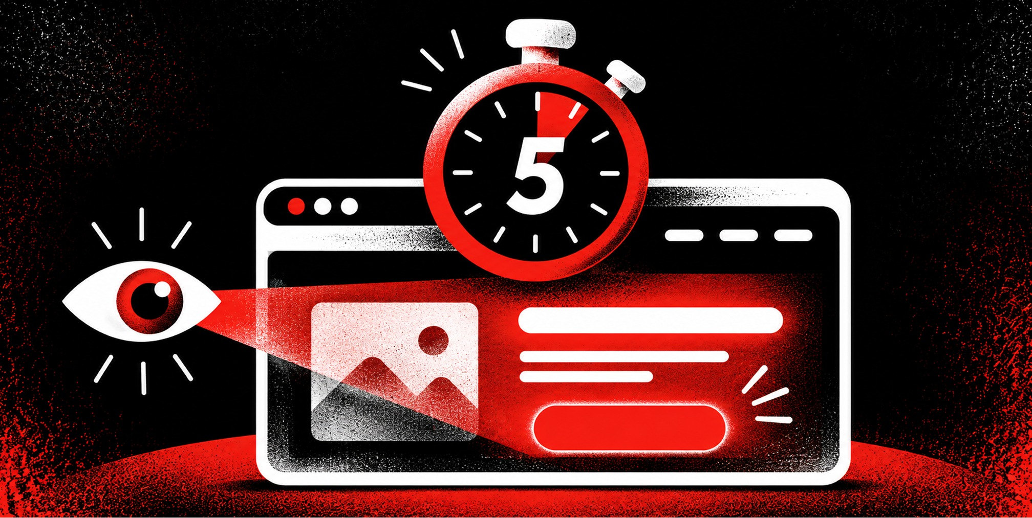
A five second test shows a design to a stranger for five seconds, hides it, then asks what they remember. If they can’t say what you sell, who it’s for and what to do next, your page has a positioning problem that no amount of ad spend will fix. It is the fastest, cheapest way to find that out before a launch, a rebrand or a paid campaign.


What a five second test measures
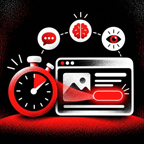
This guide is for founders, CMOs and marketing directors who need to judge a homepage, landing page or campaign creative quickly. It covers when the test works, how to run it step by step, which questions to ask and how to turn vague answers into decisions.
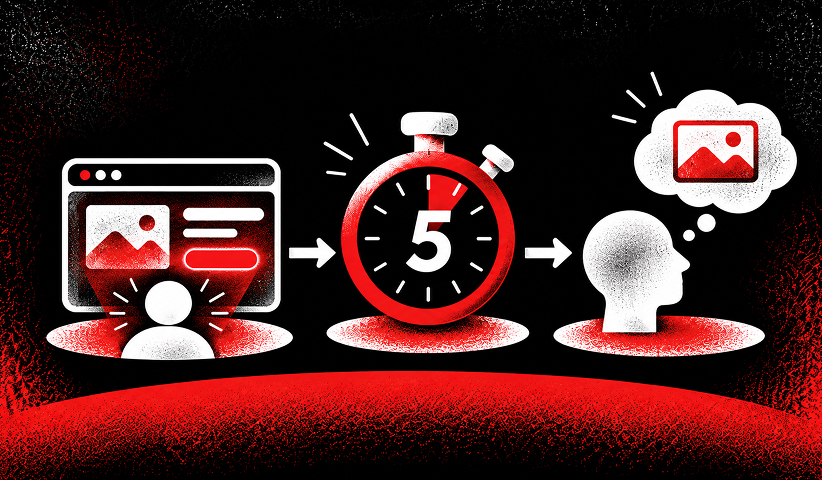
The method is simple. A participant sees a screenshot, a mockup or an ad for exactly five seconds. The design disappears. Then they answer questions from memory. What you collect is not an opinion on whether the design is pretty. It is a record of what survived a glance.
That matters because real visitors don’t read, they scan. Nielsen Norman Group’s research on how long users stay on web pages found that many visits are very short, so the first screen has little time to prove the page is relevant. If the value proposition isn’t visible in that window, the rest of the page rarely gets read.
The test gives you three kinds of signal:
- Comprehension: can people identify the product or service, its audience and the central benefit without hints?
- Recall and visual hierarchy: which headline, image, brand cue or offer survives the brief exposure?
- Next-step clarity: can people describe the action the page or ad invites them to take?
It does not tell you whether people can complete a task, how they navigate or why they hesitate at checkout. For that you need usability tests, session recordings and A/B tests. Think of the five second test as the front door check: it asks whether people understand the building well enough to walk in.
When the test is worth running
Run it when the cost of a wrong first impression is high and the design is still cheap to change.
Before a rebrand or repositioning: If you are moving upmarket, entering a new category or changing your name, test whether the new homepage communicates the new position. Brand work lives or dies on whether strangers repeat back the idea you intended. A gap between your internal story and what viewers say is the most useful result you can get at this stage.
On a landing page before you buy traffic: Paid clicks are expensive. A landing page that fails the test will waste budget on every visitor. Our guide to high-converting landing pages covers the elements that should be visible on that first screen.
On ad creative: A static ad or a video’s opening frame gets the same brief attention. Testing a few variants for message clarity before launch is cheaper than discovering a weak concept after spend has gone out. It pairs well with a creative testing strategy that measures performance once the ads are live.
On packaging and print: Shelf and screen both reward a clear single message. Show a product photo for five seconds and ask what the product is and who it’s for.
After a redesign: Compare the old and new versions with the same questions and the same type of participants. Differences in comprehension are easy to report to a board.
The test is a weaker fit for deep, multi-step experiences such as a SaaS dashboard, a long configuration flow or a complex pricing calculator. Five seconds is not enough to judge those. Test the entry point instead, such as the marketing page that leads into them.
How to run a five second test, step by step
1. Decide what the first five seconds must achieve
Write one sentence: “After five seconds, a visitor should know that we [do X] for [Y] and that the next step is [Z].” This is your answer key. Without it, you will read every response as a win.
For a B2B SaaS homepage, the sentence might be: “We help finance teams automate invoice approvals, and I can book a demo.” For a direct-to-consumer product page: “This is a protein snack with no added sugar, and I can buy it.”
2. Prepare the stimulus
Use what a visitor would actually see. For a web page, capture the above-the-fold area at a realistic screen size, not a zoomed-out full-page scroll. Run mobile and desktop as separate tests, because the first screen is different on each.
Test one design at a time. If you want to compare two headlines or two hero images, split participants into groups so nobody sees both. Seeing the second version contaminates what they recall about the first.
Keep it clean: no annotations, no placeholder text, no “lorem ipsum”. Participants will remember whatever is on the screen, including your mistakes.
3. Write two to four questions
More questions dilute memory and tire participants. Keep them open-ended so people describe in their own words instead of choosing from options you wrote. The next section has a full question bank.
4. Recruit the right participants
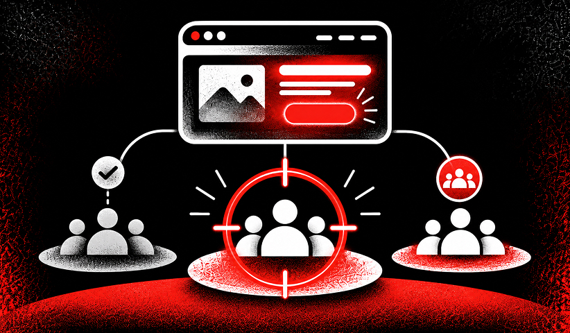
This is where most tests go wrong. Your coworkers have seen the design and know the product. A friend in another industry is not your buyer. Recruit people who resemble your target customer: a VP of marketing for a B2B tool, a parent shopping for a kids’ brand, a founder for a startup service.
Fifteen to twenty responses per design is a practical target for spotting patterns. If five of fifteen people call you a “payment processor” when you are a billing platform, you don’t need a larger sample to know the message is blurry.
5. Set the timer and run it
Use a research platform that displays the image for exactly five seconds and then hides it, or run a moderated session over video with a slide that advances automatically. Tell participants beforehand that they’ll see a design briefly and will be asked what they remember. There is no right or wrong answer.
6. Code the answers
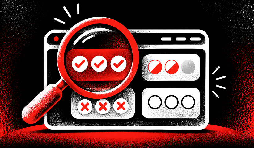
Read every response and tag it against your answer key. A simple scheme works:
- Correct: response names the intended category, audience and/or offer accurately.
- Partial: response identifies the category but misses an important audience, benefit or action.
- Wrong: response describes an unrelated category, promise or action.
- Blank: response contains no useful recollection.
Count each tag, then pull the exact phrases people used. Those phrases are valuable copy research.
7. Change one thing and retest
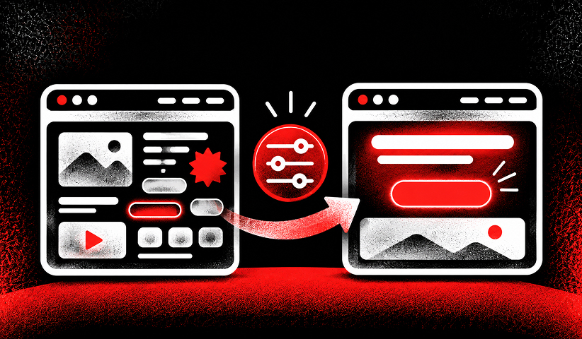
Pick the element most likely to have caused the misses, usually the headline, the hero image or the primary button. Change it, rerun the test with a fresh group and compare the tag counts. Changing five things at once leaves you guessing about which one worked.
Free Brand Health Audit
Make sure your brand is built to sell
Search has changed. Your customers aren't just Googling anymore. They're asking ChatGPT, Perplexity, Gemini and other AI platforms what to buy, who to trust and which brands they should consider.
If your brand isn't showing up clearly in those answers, you're already losing opportunities. Our free Brand Health Audit shows you where your brand stands across traditional search, AI search and brand positioning.

Sample brand audit
Live preview
Traditional search
72
AI search (GEO)
34
Brand positioning
58
Five second test questions that produce usable answers
The right questions depend on your goal. Choose from these and keep the total to four or fewer.
To test comprehension
- What does this company or product do?
- Who do you think this page is for?
- What problem does it promise to solve?
To test recall
- What is the first thing you remember seeing?
- Which words, images or colors stood out?
- What product or brand name, if any, do you remember?
To test impression and brand
- What three words describe the impression this design gave you?
- What kind of company do you think this is?
- What made the page seem trustworthy or untrustworthy?
To test the call to action
- What would you do next if this were relevant to you?
- What action did the page invite you to take?
- What did the main button appear to offer?
To test an ad
- What product or service was this ad promoting?
- What was the main promise in the ad?
- Who did the ad seem intended for?
Avoid leading questions such as “Did you notice our free trial?” and yes/no questions such as “Was the design clear?” Everyone says yes. Ask “What was the offer?” instead and see who can answer.
How to read the results
Five second tests produce short text answers, so the analysis is about patterns, not statistics.
Look for convergence. If most participants describe the same thing, even if it’s the wrong thing, you have found how the page is perceived. If answers scatter in all directions, the page has no dominant element and the eye has nowhere to land.
Check what people remembered first. Recall of a stock photo or a decorative graphic instead of the headline means the visual hierarchy is working against your message. Recall of the headline but not the offer means the supporting line or button is too quiet.
Compare against a bar you set in advance. A practical bar for a homepage: at least two thirds of relevant participants state the category and the audience correctly. Treat it as a working standard for your team, not an industry law, and adjust it to your risk.
Separate comprehension from appeal. A page can be understood and still feel generic. Another can feel premium and be impossible to explain. You want both, and the test lets you see which is missing.
Use the words people give you. If buyers keep calling your product “an inbox tool” and you’ve been saying “communication intelligence platform”, the market has just told you which phrase to put in the headline.
- People guess the wrong category. Likely cause: the headline is abstract or overly clever. First fix: name the category and outcome in plain language.
- People remember the image, not the offer. Likely cause: the hero visual overwhelms the message. First fix: reduce visual weight and improve headline prominence.
- People cannot identify the audience. Likely cause: no clear customer qualifier. First fix: add language such as “for B2B finance teams.”
- People do not know what to do next. Likely cause: weak or competing calls to action. First fix: use one prominent button with a specific verb.
- Answers vary widely. Likely cause: too many competing messages. First fix: simplify to one promise, one focal point and one action.
Want to learn more about Website Design, Development and E-commerce? Keep reading!
If you need help with your company’s website and development, contact us for a free custom quote.
Common mistakes that spoil the test
- Testing coworkers or existing customers who already know the offer instead of recruiting new, relevant buyers.
- Allowing participants to see the design again, which turns a recall test into a reading exercise.
- Using leading questions that reveal the intended answer or ask whether the design looks attractive.
- Showing a full-page screenshot instead of the first screen visitors actually see.
- Comparing two versions with the same people, allowing the first design to influence the second.
- Treating a small numerical difference as statistically conclusive instead of reviewing patterns and verbatim responses.
- Redesigning several major elements at once and losing the ability to learn which change improved clarity.
Where the five second test fits in a conversion program
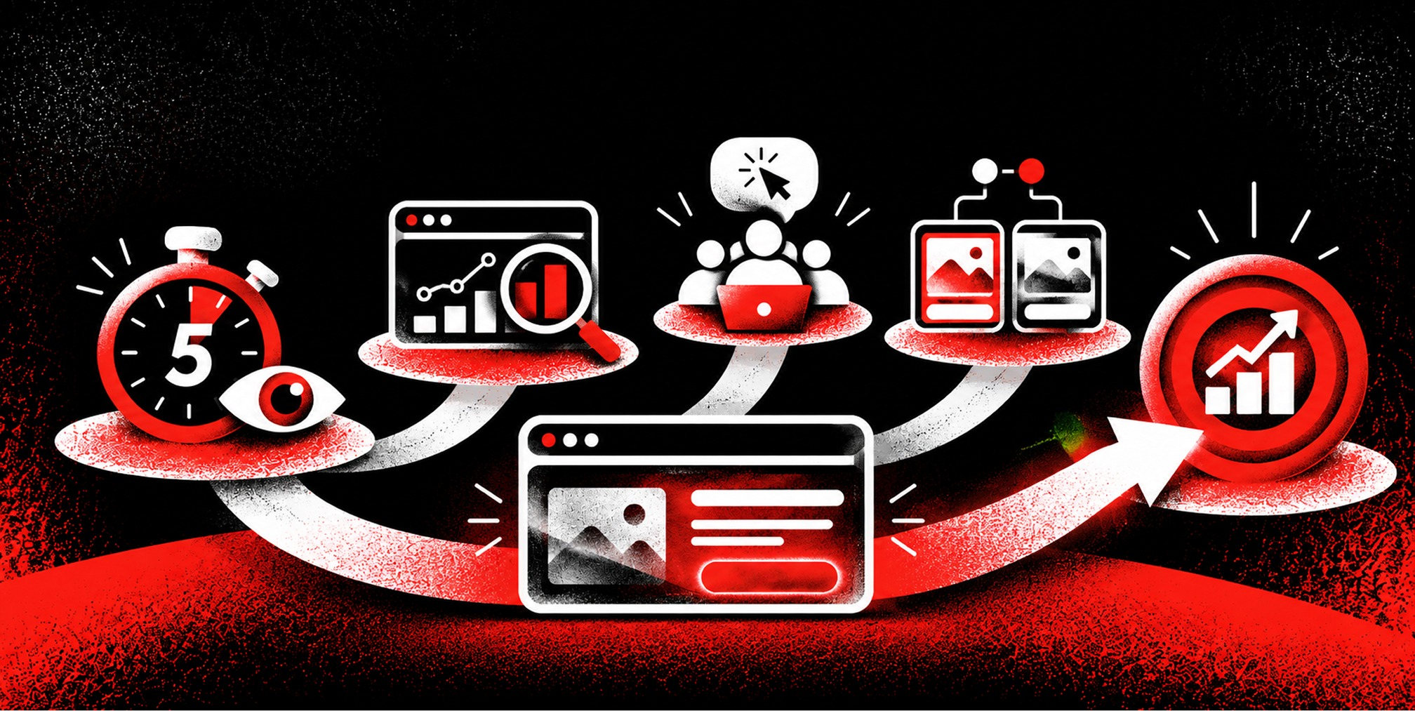
The test answers “do people get it?” Other methods answer different questions. Conversion rate optimization combines them: first-impression tests to fix clarity, analytics to find where visitors drop off, and live experiments to confirm that a change lifts results. A sensible order is:
- Run a five second test on the first screen to check category, audience and offer comprehension.
- Revise the headline, focal point or call to action using the most common misunderstandings.
- Run a short task-based usability test to check navigation, form completion and objections.
- Launch a controlled A/B test when traffic and experiment design support a reliable comparison.
- Monitor qualified conversions and acquisition cost to see whether clearer communication improves business outcomes.
If you’re planning a new site, the same logic applies earlier. Our website design tips explain how hierarchy, spacing and copy decide what a visitor takes in first.
Our perspective
A five second test is one of the most honest tools a marketing team has, because it removes the room full of people who already know the story. A stranger either gets your positioning or they don’t.
We build brand and performance work as one system, which is why we pay close attention to the first screen. Branding sets the idea you want to own. Creative and web turn that idea into a headline, an image and a button. Paid media and retention then send people to it and bring them back. If the first five seconds fail, the rest of the funnel pays for it.
That is why we treat first-impression clarity as a brand question and a revenue question together. A homepage that explains your position in plain words makes ad spend work harder, because the people you pay to reach understand why they should stay. For growth-stage and VC-backed companies, where every dollar of acquisition cost is scrutinized, that clarity is the cheapest improvement available.
Our advice: write the sentence a stranger should repeat back, design the first screen to deliver it, and keep testing until they do.
-Quincy Samycia
Get the first screen right with Branded
If your test shows that visitors can’t repeat your positioning, the fix usually spans brand strategy, copy, design and the page build, not one tweak. We work across branding, website design and development and performance marketing, so the message, the page and the traffic are planned together. Published monthly pricing starts at $4,000 for Creative Services and $5,500 for Paid Media Management, and you can see every service on our pricing page.
If you’re preparing a rebrand or a launch and want the first screen to land, talk to us through brandedagency.com.
Frequently Asked Questions
What is a five second test in UX?
It is a research method in which participants view a design for five seconds and then answer questions from memory. It shows what a design communicates at a glance: the message, the audience and the impression it leaves. Teams use it on homepages, landing pages, ads and packaging.
How many participants do I need?
Fifteen to twenty relevant participants per design is a workable range for spotting patterns in open-ended answers. If the same misunderstanding appears in several responses, you have enough to act. Quality of recruitment matters more than volume: a small group that matches your buyer beats a large group that doesn’t.
What is the difference between a five second test and a usability test?
A five second test checks first impression and comprehension. A usability test watches people attempt tasks, such as finding a price or completing a signup, and shows where they struggle. Run the five second test first to confirm the page is understood, then use task-based testing to examine how it works.
What should I do if people remember nothing useful?
That result means the first screen has no clear focal point. Reduce it to one message, one image and one action, put the headline in plain language and make the main button obvious. Then retest with a new group of participants and compare the results.
Can I use the test on ads and packaging?
Yes. Show the ad or the pack for five seconds and ask what it is selling, who it’s for and what the viewer is asked to do. Testing several concepts with separate groups before launch helps you pick the clearest one.
Sources
- Nielsen Norman Group — How Long Do Users Stay on Web Pages? — https://www.nngroup.com/articles/how-long-do-users-stay-on-web-pages/
- Lyssna — Five Second Testing Guide — https://www.lyssna.com/guides/five-second-testing-guide/
- Lyssna Help Center — Five-Second Test Sections — https://help.lyssna.com/en/articles/4952945-five-second-test-sections
- Lyssna — Usability Testing Guide — https://www.lyssna.com/guides/usability-testing-guide/

Quincy Samycia
As entrepreneurs, they’ve built and scaled their own ventures from zero to millions. They’ve been in the trenches, navigating the chaos of high-growth phases, making the hard calls, and learning firsthand what actually moves the needle. That’s what makes us different—we don’t just “consult,” we know what it takes because we’ve done it ourselves.
Want to learn more about brand platform?
If you need help with your companies brand strategy and identity, contact us for a free custom quote.
We do great work. And get great results.
+2.3xIncrease in revenue YoY
+126%Increase in repurchase rate YoY


+93%Revenue growth in first 90 days
+144% Increase in attributed revenue



+91%Increase in conversion rate
+46%Increase in AOV

+200%Increase in conversion rate
+688%Increase in attributed revenue