Launch a Landing Page Design That Converts in 30 Days for Marketers
11/05/2026
Branding
Learn how to design a high-converting landing page in 30 days by optimizing headlines, CTAs, social proof, mobile performance, and user experience.
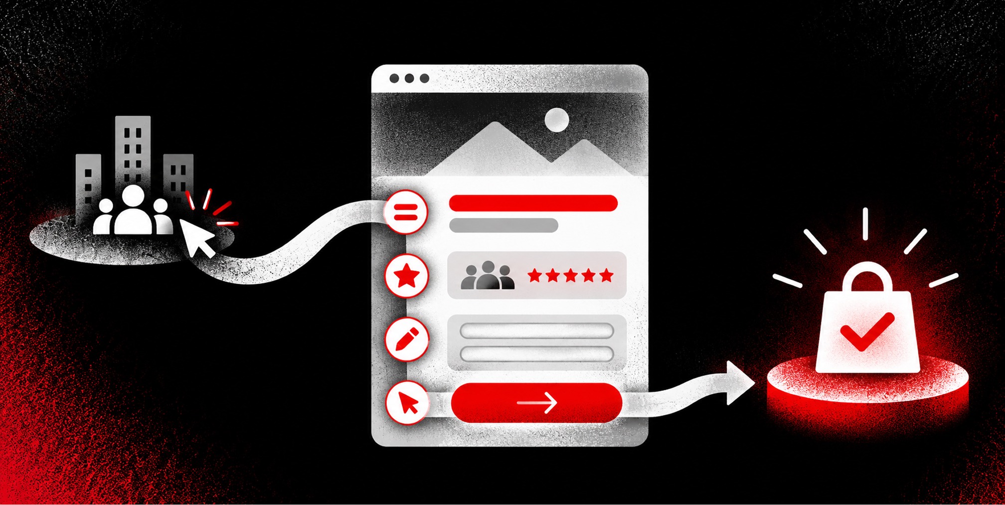
A landing page converts best when it makes one offer, gives one dominant call to action, and removes every distraction between the click and that action. Beyond that single-offer discipline, the highest-impact levers are a message-matched headline, a fast mobile experience, credible social proof near the top, and a lean form. Everything else in this guide exists to support those five elements, and the checklists below will show you exactly where to start.


Landing Page Design Best Practices: The Anatomy of a Page That Converts
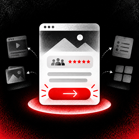
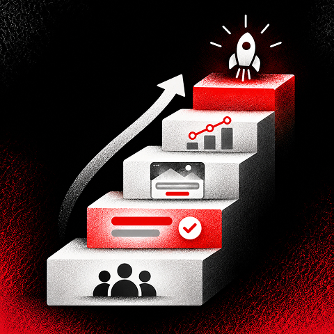
A landing page is not a mini website. It’s a single argument, built section by section to move one visitor toward one decision. Every element earns its place by either building trust or removing hesitation, and the order matters as much as the content.
The hero comes first, and it does most of the persuasive work in under five seconds. That means a headline that states the outcome, a subheadline that clarifies who it’s for, a supporting visual that shows the product or result, and a CTA button visible without scrolling. If a visitor has to scroll to find out what you’re offering, the hero has already failed.
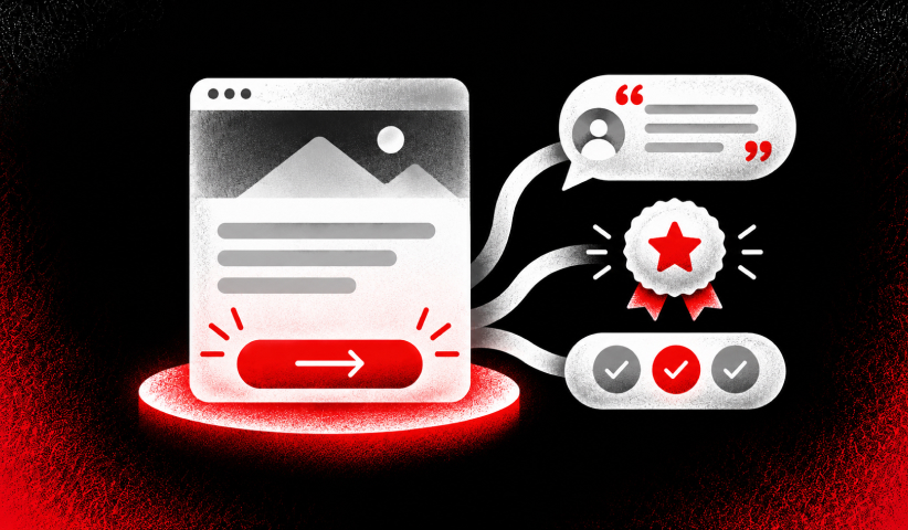
Trust signals belong close to the CTA, not buried in a footer. A well-designed landing page combines a compelling headline, mobile optimization, imagery, and credibility signals into one coherent push toward conversion, and proximity is what makes those signals actually influence the decision rather than just decorate the page.
Below the hero, benefit blocks answer the objections a visitor is silently raising. Proof sections, whether testimonials, case metrics, or client logos, exist to answer “why should I trust this?” right when that doubt surfaces.
The essential sections, in order:
- Hero: One outcome-led headline, supporting explanation, relevant visual and prominent primary CTA.
- Benefits: Three concise blocks that connect capabilities to customer problems and outcomes.
- Proof: A relevant customer testimonial, case study, verified result or credential that supports the offer.
- Objection handling: Explain pricing, setup, eligibility, risk or other concerns that could stop a decision.
- Conversion area: A short form or clear next-step CTA, with privacy reassurance and an explicit expectation of what happens next.
- Final CTA: Repeat the same primary action after the key evidence; avoid introducing a competing offer.
Skip a section here and you’re asking the visitor to fill in a gap in your argument themselves. Most won’t bother.
Core Landing Page Optimization Checklist: What to Build First
Building a page in the right order saves you from redesigning it twice. This sequence reflects where the conversion research consistently points: structure and clarity first, decoration last.
Pro Tip: Before you write a single word of copy, screenshot the ad or email that will drive traffic to this page. Pin it next to your headline draft. If the words don’t rhyme within the first ten seconds of reading, rewrite the headline, not the ad.
1. Confirm one audience, one offer and one primary conversion event before writing or designing.
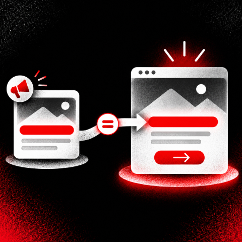
2. Match the landing page headline and imagery to the ad, email or keyword bringing the visitor in.
3. Draft the hero, primary CTA, benefits, proof and friction-reducing form before polishing decoration.
4. Check reading order, mobile spacing, tap targets, label clarity and accessible contrast.
5. Compress imagery, remove unnecessary scripts and test real-user page speed.
6. Configure form-submit or completed-action tracking, source tagging and duplicate-event protection.
7. Test submissions end to end, including confirmations, CRM delivery and error handling.
A few of these deserve more nuance than a checklist item allows.
Message match is a business problem, not just a copy problem. Marketing teams often approve a campaign headline and a landing page headline separately, on different timelines, written by different people. The fix is procedural: whoever approves the ad copy should approve the landing page headline in the same sitting. Our approach to high-converting ad copy starts from this exact discipline, treating the ad and the page as one continuous sentence rather than two separate assets.
Above-the-fold real estate is the most contested space on the page, and it’s tempting to cram in a value proposition, a secondary CTA, a trust badge, and a hero image all at once. Resist it. One CTA does the job of persuasion; a second one just gives the visitor permission to hesitate. If you have a genuinely important secondary action (say, “Watch a 2-minute demo” alongside “Start Free Trial”), make it visually smaller and lower in contrast so the hierarchy stays obvious.
Distractions extend beyond navigation. Auto-playing carousels, chat widgets that pop up mid-scroll, and unrelated blog links in the footer all compete for attention that should be going toward the conversion goal. If an element doesn’t build trust or reduce friction toward the CTA, it’s a candidate for removal, regardless of how nice it looks in a mockup.
Tracking setup is where most teams under-invest before launch. At minimum, you need conversion tracking on the CTA, scroll-depth tracking to see how far visitors get, and a way to segment results by traffic source. Skipping this means your first “successful” campaign is really just an untested guess that happened to work, and you’ll have no idea which lever to pull next time.
This checklist isn’t meant to be exhaustive. It’s meant to get a page live, measurable, and structurally sound within days, not weeks, so you can start learning from real visitor behavior instead of internal debate.
Copywriting and Headline Strategy for Landing Pages
The headline is the highest-leverage sentence on the page, and it works best when it follows a simple formula: outcome, audience, and timeframe when a timeframe genuinely applies. “Cut Onboarding Time in Half for Enterprise Teams” tells a visitor exactly what they get and who it’s for, in seven words.
The subheadline’s job is different. It clarifies who the offer is for and why it matters right now, giving context the headline doesn’t have room for. Think of the headline as the promise and the subheadline as the proof that the promise applies to this specific visitor.
CTA copy should describe the immediate next step, not a vague commitment. “Start Your Free Trial” beats “Submit” because it tells the visitor what happens the instant they click.
A few copy rules that consistently pay off:
1. Write in the language customers use for the problem rather than internal product jargon.
2. Lead with one specific benefit and make supporting claims demonstrable; do not invent results.
3. Use descriptive CTA language such as “Book a Consultation” or “Get the Guide” instead of “Learn More” when the next action is known.
4. State eligibility, cost, timing or limitations where they could otherwise surprise a visitor.
5. Keep paragraphs skimmable and prioritize meaningful subheadings over dense blocks of copy.
6. Every sentence on the page should answer a question the visitor is actually asking. If it doesn’t, cut it.
Imagery and Video: Visuals That Communicate, Not Decorate
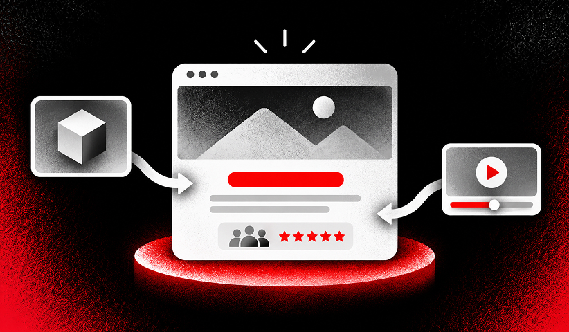
Every image and video on a landing page should answer a question the copy hasn’t already answered. If it’s purely decorative, it’s competing for load time against elements that actually convert.
Product-in-use imagery outperforms generic stock photography almost every time, because it shows the visitor what they’re actually getting rather than an aspirational stand-in. Real customer photos work even better when you have them, since they double as a form of social proof.
Short explainer or demo videos, kept to 15 to 45 seconds, work well for offers complex enough to need visual walkthrough, but they should never autoplay with sound and should never sit above the CTA where they’d delay the visitor from acting.
A few non-negotiables for visual hierarchy:
1. Use a real product screenshot, demonstration or outcome-focused photograph when it explains the offer.
2. Keep the headline and CTA visually dominant; avoid visuals that pull attention away from the decision.
3. Provide informative alt text, captions where needed and accessible controls for video.
4. Use responsive image sizes and reserve image dimensions to reduce layout shifts.
5. Validate every graphic at mobile size before approving desktop-only compositions.
6. Visuals should earn their place the same way copy does: by reducing doubt or clarifying the offer, not by looking impressive in a design review.
Social Proof and Trust Signals: What Belongs Near the Hero
The most persuasive proof you have should sit as close to the hero as possible, not scrolled three sections down. Visitors decide whether to trust a page within seconds, and early visibility of named, specific proof does more for conversion than the same proof buried lower on the page, a pattern confirmed in design research on B2B SaaS landing pages.
Named testimonials with a real name, title, and company outperform anonymous quotes, and a concrete metric (“cut support tickets by 30% in six weeks”) outperforms a vague compliment every time. If you sell into regulated or risk-sensitive industries, relevant certifications or security badges near the form matter more than almost any other trust element, because they answer a compliance objection before it’s raised.
The median landing page conversion rate sits around 6.6%, but that figure swings widely by vertical, which is exactly why comparing your page against a single global benchmark can be misleading.
Resist the urge to stack every client logo you’ve ever earned into a busy strip. A handful of recognizable, relevant logos beats a wall of twenty generic ones, since visitors skim past clutter but pause at specificity.
Forms and Fields: Reducing Friction Without Losing Lead Quality
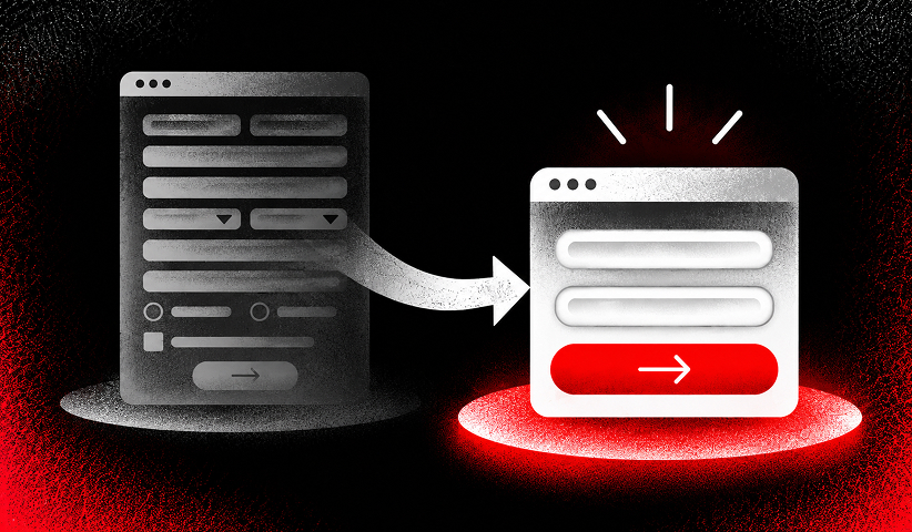
Field count should match offer value, and mismatching the two is one of the most common landing page mistakes marketing teams make. A free checklist download doesn’t need a phone number and company size; a $50,000 enterprise demo request can justify asking for more.
For low-value offers, keep it to one to three fields, typically name, email, and maybe one qualifier. For higher-value offers where sales needs to prioritize leads, a multi-step form or progressive profiling approach works better than one long form, because breaking commitment into smaller steps raises completion rates compared to asking for everything at once.
Inline validation and clear labeling matter more than they get credit for. A field that quietly rejects a phone number format without explaining why is a silent conversion killer.
Free Brand Health Audit
Make sure your brand is built to sell
Search has changed. Your customers aren't just Googling anymore. They're asking ChatGPT, Perplexity, Gemini and other AI platforms what to buy, who to trust and which brands they should consider.
If your brand isn't showing up clearly in those answers, you're already losing opportunities. Our free Brand Health Audit shows you where your brand stands across traditional search, AI search and brand positioning.

Sample brand audit
Live preview
Traditional search
72
AI search (GEO)
34
Brand positioning
58
Mobile Optimization and Page Speed: The Non-Negotiable Foundation
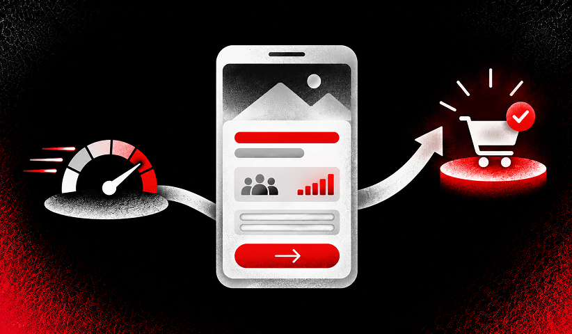
Speed and mobile layout aren’t polish, they’re the foundation everything else sits on, especially since more than half of all web traffic now arrives on mobile devices. A beautifully designed page that loads slowly on a phone never gets the chance to persuade anyone.
Google’s Core Web Vitals give concrete, measurable targets rather than vague “make it fast” advice: Largest Contentful Paint under 2.5 seconds, Interaction to Next Paint under 200 milliseconds, and Cumulative Layout Shift under 0.1.
Improving LCP and visual stability measurably raises conversion in controlled testing, which means page speed isn’t just a technical metric, it’s a direct lever on your conversion rate.
On mobile specifically, use a single-column layout with tap targets at least 48 pixels tall, since anything smaller creates mis-taps and frustration. Compress every image, lazy-load anything below the fold, and serve assets through a content delivery network so load time doesn’t degrade for visitors far from your server.
How Should You Test and Optimize a Landing Page?
Start with the headline and the CTA, because these two elements typically produce the largest conversion swings of anything you can test on a landing page. A dramatic redesign might feel more satisfying, but it’s rarely where the biggest lift actually comes from.
Pro Tip: Run session replay for a week before you write your first test hypothesis. Watching ten real visitors struggle with the same field or scroll past your CTA teaches you more than any dashboard chart will.
Choose one hypothesis based on analytics, session replay, interviews or sales feedback, such as “matching the ad promise in the hero will increase qualified demo requests.”
Name one primary outcome metric and guardrails such as lead quality, form errors and page speed before launching.
Estimate required sample size and test duration using the baseline rate and a meaningful minimum detectable effect.
Change one major element per A/B experiment when interpretability matters, and split visitors consistently.
Check tracking integrity and traffic balance, then run the test to its preplanned stopping rule.
Document wins, losses and inconclusive results; roll out a winner only after confirming downstream quality.
Only a minority of marketing teams consistently test their landing pages compared to how often they test email or paid social creative, despite landing pages carrying enormous leverage over campaign ROI. A structured CRO program closes that gap by making testing a scheduled habit instead of an occasional experiment.
Which Metrics Actually Matter for Landing Page Performance?
Conversion rate segmented by traffic source, device, and persona tells you far more than one blended number ever will, since a page performing well on desktop can be quietly failing on mobile.
Bounce rate, scroll depth, and form abandonment reveal where visitors lose interest or hit friction, and page load metrics explain a good chunk of that behavior before you even look at the copy.
Use vertical benchmarks, not a single blanket number, to judge whether your results are actually competitive.
Landing Page Examples and Patterns Worth Copying
Four patterns cover most campaign situations, and picking the right one before you design saves rework later.
- High-intent demo page: Lead with the solution and proof, show what the demo covers, and use a qualification-aware booking form.
- Lead-magnet page: Explain the immediate value of the download, show a preview and request only essential information.
- Product or free-trial page: Demonstrate the interface and first-value moment, address setup concerns, and emphasize the trial action.
- Event or seasonal promotion page: Put the offer, eligibility, genuine deadline and signup action together, with mobile-friendly confirmation.
Seasonal or campaign-specific builds, like the patterns in effective holiday landing pages, often borrow the hero-first structure but add urgency elements tied to a real calendar deadline.
Want to learn more about brand platforms, Brand Strategy and Brand Identity? Keep reading!
If you need help with your companies brand strategy and identity, contact us for a free custom quote.
Expert Checklist: A 30/60/90-Day Landing Page Plan
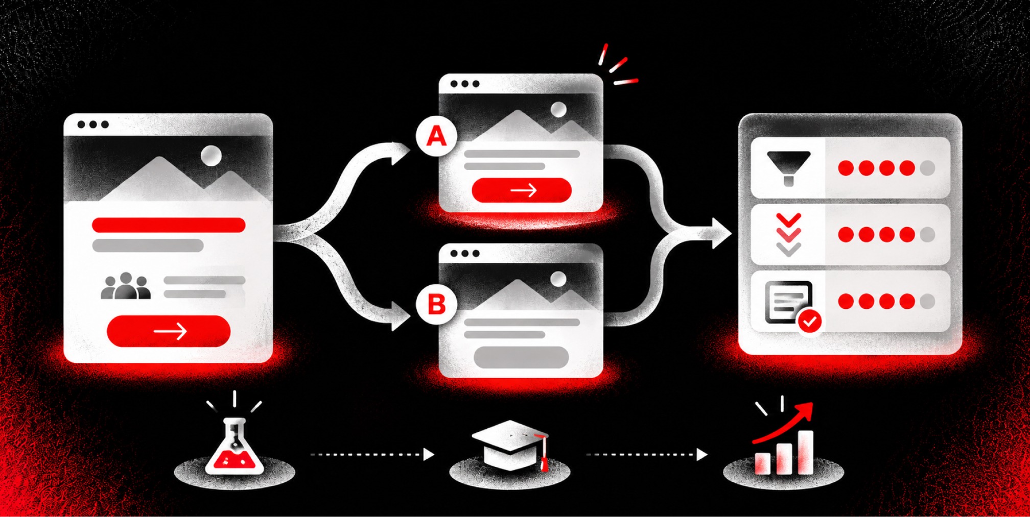
A landing page program works best on a cadence, not a one-time launch. Here’s the sequence we walk clients through at The Branded Agency:
Days 1–7, diagnose: Audit existing conversion data, intent, user objections and source-to-page message match; define the offer and primary action.
Days 8–14, build: Draft the hero and proof hierarchy, simplify the form, establish the mobile layout and implement conversion tracking.
Days 15–21, quality-check and launch: Verify responsive behavior, accessibility, Core Web Vitals, submission delivery and analytics before sending traffic.
Days 22–30, learn: Review device- and channel-level conversion, form errors and lead quality; select one high-impact hypothesis for testing.
Days 31–60, optimize: Run appropriately powered tests, improve weak segments and document results.
Days 61–90, scale: Apply proven changes to related campaigns, assess qualified pipeline and set the next iteration backlog.
Clear handoffs matter here: copy drafts the headline, design builds hierarchy, development owns speed, analytics owns tracking, and sales feeds back lead quality every 30 days.
Should Your Landing Page Be Short or Long?
Page length isn’t a style choice, it’s a decision driven by traffic intent and offer complexity. Short, hero-first pages fit high-intent paid traffic and simple, low-commitment offers, where visitors already know what they want.
Long-form pages fit high-value B2B offers that need to satisfy a buying committee across operations, security, and budget concerns in one sitting. For mixed-intent traffic, a hybrid works best: a strong hero for the skimmers, with depth available below for visitors who need more convincing before they commit.
Build and Test Your Next Landing Page With The Branded Agency
Most of what separates a landing page that converts from one that doesn’t isn’t a design trick, it’s disciplined execution across strategy, copy, speed, and testing, all at once, on a deadline. This gap is often a challenge for growth-stage teams who don’t have the internal bandwidth to run headline tests, fix Core Web Vitals, and rebuild proof sections in the same sprint.
Our team pairs strategic website development with paid media management and conversion rate optimization, so the page, the ad, and the tracking get built as one system instead of three disconnected projects. That mapping matters: a page redesigned in isolation from the campaign driving traffic to it rarely moves the needle the way a coordinated build does.
If your current page is guessing rather than testing, book a landing page audit with The Branded Agency and get a prioritized list of fixes, ranked by expected impact, before your next campaign launches.
Frequently Asked Questions
What is the most important element of a landing page?
A clear, relevant offer paired with one primary call to action is the starting point. The headline must match the promise that brought the visitor to the page, while supporting proof and a low-friction next step help them decide.
What is a good landing page conversion rate?
A useful rate depends on industry, traffic intent, offer, device and how a conversion is defined. Compare each page with its own history and segment by acquisition source and lead quality rather than relying on one universal benchmark.
How many fields should a landing page form have?
Ask only for information needed to deliver the offer or route the lead. A simple download may need only an email address, while a high-value enterprise demo can justify additional qualification fields. Test changes against both completion and sales acceptance.
How long does it take to build and launch a landing page?
A focused landing page can be planned, built, quality-checked and launched within 30 days when the offer, approvals and technical access are available. More complex integrations or compliance reviews may extend the timeline.
Should a landing page have navigation links?
For a single campaign goal, removing unnecessary navigation can reduce competing paths. Keep essential privacy, accessibility, legal and trust information available, and test navigation decisions with the audience and offer.
What should marketers test after a landing page launches?
Start with the largest observed bottleneck, often message match, headline clarity, CTA, proof placement or form friction. Define the primary metric and sample plan first, then validate whether changes improve qualified outcomes, not just clicks.
How do you measure landing page performance?
Measure completed conversions alongside traffic source, device, form abandonment, page speed and downstream lead quality. For B2B campaigns, connect submissions to CRM stages so the team can evaluate qualified pipeline rather than raw lead volume.

Quincy Samycia
As entrepreneurs, they’ve built and scaled their own ventures from zero to millions. They’ve been in the trenches, navigating the chaos of high-growth phases, making the hard calls, and learning firsthand what actually moves the needle. That’s what makes us different—we don’t just “consult,” we know what it takes because we’ve done it ourselves.
Want to learn more about brand platform?
If you need help with your companies brand strategy and identity, contact us for a free custom quote.
We do great work. And get great results.
+2.3xIncrease in revenue YoY
+126%Increase in repurchase rate YoY


+93%Revenue growth in first 90 days
+144% Increase in attributed revenue




+91%Increase in conversion rate
+46%Increase in AOV

+200%Increase in conversion rate
+688%Increase in attributed revenue