Top 7 Essential Tips to Design Website for Outstanding Results in 2026
06/23/2026
Web Design / Web Dev
Learn the proven website design strategies that help businesses create faster, higher-converting websites that attract, engage, and convert modern users.

Building a website that actually works for your business has never been more challenging—or more important. In 2026, pretty websites are no longer enough. Your site needs to be strategic, intentional, and easy for both humans and AI to understand. The shift toward experience-over-aesthetics means that overdesigned sites with heavy animations and cluttered layouts simply won’t convert. Clean, thoughtful web design that guides visitors effortlessly will win every time. Including your company name in your domain or branding is also crucial, as it improves search visibility and helps establish strong brand recognition from the start. This guide breaks down the seven essential design tips that separate high-performing websites from digital dead ends.
.png)


How We Chose the Best Website Design Tips



We selected these web design tips based on several key criteria:
- Proven impact on user experience and conversions — Every tip directly affects how visitors interact with and respond to your site
- Actionable advice for most website types — Whether you’re running e-commerce or a service-based business website, these principles apply
- Ease of implementation — Tips range from quick wins to long-term improvements
- Current web standards and best practices — All recommendations align with 2026 search engine requirements
- Balance of aesthetics and functionality — Beautiful design that actually works
- Mobile experience and accessibility — Non-negotiable elements that affect the majority of web users
Free Brand Health Audit
Make sure your brand is built to sell
Search has changed. Your customers aren't just Googling anymore. They're asking ChatGPT, Perplexity, Gemini and other AI platforms what to buy, who to trust and which brands they should consider.
If your brand isn't showing up clearly in those answers, you're already losing opportunities. Our free Brand Health Audit shows you where your brand stands across traditional search, AI search and brand positioning.

Sample brand audit
Live preview
Traditional search
72
AI search (GEO)
34
Brand positioning
58
Top 7 Website Design Tips for Outstanding Results




These design tips represent the foundation of effective website design in 2026. Master these fundamentals before chasing trends. Guiding users through clear navigation, well-placed calls to action, and thoughtful user experience strategies is essential to ensure visitors can easily find information and complete desired actions.
1. Master Visual Hierarchy and Layout Structure
Visual hierarchy refers to the arrangement, size, color, and contrast of visual elements, determining their relative prominence and the order in which they are seen by the human eye. It’s the systematic arrangement of design elements that guides your target audience through your content in order of importance.
This tip tops our list because it directly impacts whether visitors understand your message and take action.
Why It Stands Out
The main components of visual hierarchy include size and weight, element placement, color, contrast, and spacing, which help guide visitors’ attention to important elements in order of priority. When done well, visual hierarchy eliminates confusion and creates a clear path toward conversion.
Using size, color, and spacing in web design, supported by innovative creative design strategies that align visuals with business goals, can guide users to perceive important elements more effectively. This means your most critical content gets seen first, while supporting information flows naturally afterward.
Best For
- E-commerce sites where users must quickly find products and CTAs
- Service-based websites guiding visitors toward booking or inquiry forms
- Portfolio sites showcasing best work prominently
Key Implementation Steps
- Use size and contrast to emphasize important elements—larger elements naturally draw attention first
- Place key information above the fold where visitors see it immediately
- Create clear content flow with white space to let important elements breathe
- Implement single-column layouts for better focus, especially on mobile devices
Using a grid-based design helps maintain consistency across different screen sizes and allows users to easily scan on-page content, enhancing the overall user experience.
Use high-contrast buttons and action-oriented language for calls to action (CTAs) to direct users toward the next step. Using color to guide visitors’ attention toward calls to action can significantly enhance their visibility and effectiveness, as colors have emotional connotations and can create visual contrast.
Common Pitfalls to Avoid
- Overloading web pages with competing visual elements — Cluttered layouts can overwhelm visitors, leading to a poor user experience
- Using unclear or generic headlines — Vague messaging fails to communicate value quickly
- Too many fonts competing for attention — Stick to 2-3 font families maximum
2. Optimize for Mobile-First Experience
Mobile-first design prioritizes designing for mobile devices before scaling up to larger screens. This approach recognizes that most users will first encounter your site on a smartphone.
Relying solely on social platforms for your business presence limits your control and consistency, while a mobile-optimized website ensures you provide accurate information and a better user experience.
Over 60% of web traffic originates from smartphones, so a mobile-first approach is essential for any business website in 2026.
Why It Stands Out
Mobile responsiveness is critical for a website to be effective, as American adults spend more than five hours on their mobile phones every day, and over one-third do all of their shopping online via mobile devices. Google’s mobile-first indexing means your search rankings depend primarily on your mobile experience, and using AI tools to boost website traffic and search performance can amplify the impact of a strong mobile build.
If potential customers find it difficult to read or navigate a website on a mobile device, they may abandon it in favor of a competitor, which can negatively impact search engine rankings.
Best For
All websites benefit from mobile optimization, particularly those targeting consumers and local businesses where users often search on-the-go.
Key Implementation Steps
- Test site functionality on various mobile devices—while emulators help, real device testing catches device-specific issues
- Ensure touch-friendly button sizes with a minimum of 44×44 pixels for easy tapping
- Simplify navigation menus for smaller screen sizes
- Optimize images and media for mobile loading speed
A mobile website should be cleaner and less cluttered than its desktop version, minimizing page elements and scaling down assets like the menu to enhance user experience.
Websites marked as ‘mobile responsive’ should adjust automatically to different screen sizes, but results can vary, so it’s important to preview the site on mobile after making changes.
Common Pitfalls to Avoid
- Assuming desktop design will work on mobile without testing
- Making interactive elements too small for comfortable tapping
- Ignoring mobile responsiveness and hoping it works itself out
3. Enhance Site Speed and Performance
Site speed directly impacts both user experience and search engine visibility. A faster website not only improves user satisfaction but also supports better visibility in Google search results.
Most users expect a page to load within 2–3 seconds, and delays beyond this often lead to immediate abandonment. When optimizing images, remember that while stock photos can be high quality, using authentic imagery is often more effective for building trust and engagement with visitors.
Why It Stands Out
Slow load times kill conversions. People expect websites to load quickly, look clean, and work seamlessly on every device. The trend is toward lightweight builds, clean layouts, and performance-first thinking.
Speed matters for search engines too—Core Web Vitals directly influence rankings, making performance optimization essential for on page SEO, especially when paired with top AI content tools that streamline production and optimization workflows.
Best For
All websites benefit from speed optimization, especially e-commerce stores and content-heavy sites where users browse multiple pages.
Key Implementation Steps
- Compress and optimize images — Use the srcset attribute to serve different image sizes based on screen resolution
- Choose reliable hosting with adequate bandwidth and fast server response times
- Minimize plugins and unnecessary scripts — Each plugin adds HTTP requests and processing overhead
- Use caching and content delivery networks (CDNs) to serve content from servers closer to users
Run your site through Google PageSpeed Insights to identify specific improvement opportunities.
Common Pitfalls to Avoid
- Using oversized high quality images without compression
- Overloading pages with animations and heavy media
- Installing redundant plugins that slow down your content management system
4. Create Intuitive Navigation and User Flow
Clear navigation can enhance user engagement and prevent frustration; simplifying menus is essential for effective website design. Navigation serves as the wayfinding system that helps visitors accomplish their goals.
A solid website structure is essential for ensuring that both users and search engines can navigate the site effectively, preventing frustration during exploration. Placing contact information and contact forms in the header or footer is crucial—not only does this make it easy for users to reach out, but contact forms also serve as an essential feature for engaging users and facilitating communication. Similarly, placing social links in prominent locations like the footer makes it easy for visitors to connect with your business on social media platforms, further enhancing user interaction and brand reach.
Why It Stands Out
Navigation is always visually prominent, so it’s an opportunity to communicate; visitors typically start their visit by scanning across the website header, making descriptive navigation labels crucial for clarity.
Effective website navigation helps visitors find relevant information quickly, preventing confusion and reducing bounce rates.
Best For
Multi-page websites, e-commerce stores, and content-rich sites where users need to find specific information.
Key Implementation Steps
- Limit main navigation to 5-7 clear menu items to avoid overwhelming visitors
- Use descriptive labels instead of clever or vague terms—“Service Pricing” beats “Solutions”
- Include search functionality for content-heavy sites
- Place contact information prominently in the website header or footer
Interestingly, research shows that the order of menu items in navigation is not as important as previously thought, with studies indicating a low correlation between the order of menu items and visitor success. Focus more on clarity than sequence.
Websites can be structured as single-page layouts or multi-page structures, with multi-page sites being the most common type found online, allowing for more information and multiple purposes.
Common Pitfalls to Avoid
- Creating complex site structure with deep hierarchies—limit to 3 levels maximum
- Using industry jargon in navigation bars that confuses web users
- Placing social media icons in the website header—it’s recommended to avoid using social media icons in the website header, as they can distract visitors and lead them away from the site, reducing the likelihood of return
Social media links belong in your footer where they won’t interrupt the user journey.
5. Implement Strong Content Strategy and Readability
Content does the heavy lifting in web design. Your visual design can attract attention, but content communicates your website’s purpose and guides users toward action.
Users scan rather than read web content; effective design should include large headlines, short paragraphs, and bullet points to enhance digestibility, particularly on high-converting landing pages designed for focused campaigns.
When planning your content, ensure you include essential sections such as service or product descriptions, FAQs, and a well-designed About Us page. A strong About Us (us page) helps establish your brand identity and builds customer trust by showcasing your story, values, and team, especially when it’s grounded in clear, consistent brand guidelines that define how you present your business.
Incorporate both internal and external links to improve navigation and SEO. Linking to other sites—especially reputable ones—can boost your site’s authority and authenticity, signaling relevance to search engines and users alike.
Why It Stands Out
Websites that perform well are structured clearly with logical headings, concise sections, and helpful editorial content that answers real questions. This means fewer waffle-filled pages and more intentional layouts that guide users through your content easily.
Search engines rely on page titles, descriptions, image alt text, and captions to understand your content, so it’s important to keep these elements clear and include relevant keywords naturally—an area where a dedicated AI content strategist role that marries AI with content planning can add significant value.
Best For
Service-based businesses, blogs, and educational websites where content drives conversions and builds trust.
Key Implementation Steps
- Write clear, scannable content with meaningful subheadings using proper heading structure
- Use bullet points and short paragraphs—readability measures how easy it is for people to recognize words, sentences, and phrases, and high readability allows users to effortlessly scan through content
- Include compelling calls-to-action throughout pages
- Add social proof and testimonials to build trust and encourage users to take action
To improve readability, avoid long paragraphs and long line lengths; paragraphs should generally be no longer than 3-4 lines, and line lengths should be limited to about 12 words.
Internal and external links are important for SEO; linking to your own content helps guide users deeper into the site, while linking to credible third-party sources establishes context.
Common Pitfalls to Avoid
- Using long paragraphs and complex jargon—using simple words and avoiding jargon can enhance readability; research shows that lowering readability levels can improve success rates for all visitors, including those with higher education
- Hiding important information below the fold
- Neglecting dynamic content updates that keep your site fresh
Optimizing your website for search engines involves ensuring that it has plenty of new, relevant content relating to the keywords you want to rank for, as well as building authority through links from well-respected sites.
6. Ensure Accessibility and Inclusive Design
Accessibility improves usability for all users, not just those with disabilities. A visually impaired user benefits from proper alt text, but so does someone on a slow connection where images don’t load.
Accessibility is now considered baseline infrastructure rather than an add-on; key elements must include descriptive alt text for images and functionality via keyboard navigation. Using a CMS platform like WordPress also gives you more control over customization, scalability, and access to SEO and accessibility tools, making it easier to implement and maintain accessible design features—especially when paired with AI-powered creative services that keep design on-brand and inclusive.
Why It Stands Out
Approximately 16% of the global population has significant disabilities, plus many users face situational limitations—bright sunlight, noisy environments, or temporary injuries. Accessible design expands your potential customers while meeting legal requirements.
Best For
All websites benefit from accessibility, particularly government, healthcare, and education sites where compliance is mandatory.
Key Implementation Steps
- Use proper heading structure (H1, H2, H3) for content organization—screen readers navigate by headings
- Maintain a color contrast ratio of at least 4.5:1 for text to ensure readability for all users, including those with low vision
- Add descriptive alt text to all images for both user interface accessibility and SEO
- Make all interactive elements keyboard accessible
Common Pitfalls to Avoid
- Relying solely on color to convey important information—always provide text alternatives
- Creating content that can’t be navigated with keyboard alone
- Ignoring font weight and sizing that affects readability
Utilizing ample whitespace helps improve readability and focus, encouraging user engagement with essential content.
7. Test, Launch, and Continuously Optimize
Web development doesn’t end at launch. The most successful websites treat launch as a starting point, not a finish line.
Data-driven design decisions separate guessing from knowing what actually works for your visitors.
Why It Stands Out
Continuous testing leads to better long-term results. Even small improvements—1-2% conversion rate increases—compound over months into substantial business impact.
Best For
All websites benefit from optimization, especially those focused on lead generation, user registration, and sales where measurable improvements directly affect revenue.
Key Implementation Steps
- Test all website functions across different devices before launch
- Set up analytics tools like Google Analytics to track user behavior
- Conduct A/B tests on key elements like headlines and CTAs
- Regularly review and update content based on performance data
Common Pitfalls to Avoid
- Launching without thorough testing across devices and browsers
- Setting up your website platform and forgetting about maintenance—security vulnerabilities accumulate and content becomes stale
Want to learn more about Website Design, Development and E-commerce? Keep reading!
If you need help with your company’s website and development, contact us for a free custom quote.
Quick Comparison of Essential Design Focus Areas

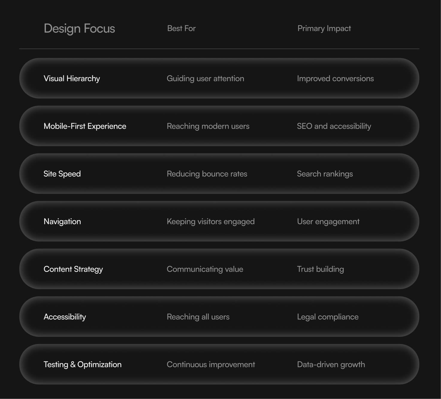
How to Choose Which Design Tips to Prioritize
Prioritize Based on Your Website’s Primary Goal
Your website’s purpose determines which tips matter most:
- E-commerce sites should focus heavily on mobile optimization and site speed—slow checkout pages kill sales
- Service businesses should emphasize clear navigation and strong content strategy that explains offerings
- Portfolio sites benefit most from visual hierarchy and mobile optimization to showcase work effectively
Consider Your Current Website’s Biggest Weaknesses
Before making changes, conduct a basic website audit:
- Run Google PageSpeed Insights to identify performance issues
- Use Google’s mobile-friendly test to check mobile responsiveness
- Review Google Analytics for high bounce rate pages
- Test website navigation by asking someone unfamiliar with your site to find specific information
Factor in Your Available Resources and Timeline
Some improvements take a few weeks while others require ongoing attention:
Quick wins (beginner-friendly):
- Image compression and optimization
- Simplifying navigation menus
- Adding descriptive alt text
- Improving heading structure
Long-term improvements (may need technical expertise):
- Hosting and CDN optimization
- Comprehensive accessibility audit
- A/B testing programs
- Site architecture restructuring
Which Tips Are Best for Your Situation?
Match your priorities to your circumstances:
- Choose Visual Hierarchy and Mobile Optimization if you’re launching a new own website and want to start with strong fundamentals
- Choose Site Speed and Navigation if you have an existing site longer than expected with high bounce rates
- Choose Content Strategy and Accessibility if you’re in a regulated industry or targeting broad audiences where brand perception matters
- Choose Testing and Optimization if you have decent traffic but poor conversion rates
As a small business owner, you might not have resources for everything. Start with mobile optimization and site speed—these provide the foundation for everything else.
Final Thoughts

Successful website design in 2026 combines multiple elements working together. There’s no single tip that transforms a site; it’s the combination of clear visual hierarchy, fast performance, intuitive navigation, and strategic content that creates a positive user experience, all while reflecting evolving branding trends in 2026 that prioritize authenticity and innovation.
The best approach depends on your specific business goals and the needs of your target audience. However, mobile-first design and site speed are non-negotiable—most platforms and search engines now require these as baseline standards, and your website should support whatever types of advertising you rely on to drive demand.
Start with the fundamentals: ensure your site works flawlessly on mobile devices, loads quickly, and has visually appealing navigation that helps visitors find what they need. Once these foundations are solid, layer in visual design refinements, content optimization, and continuous testing.
The sites that win in 2026 aren’t the most visually prominent or trendy—they’re the ones that make it effortless for every visitor to accomplish their goal. Build your website with that principle guiding every decision, and outstanding results will follow.
FAQs
What are some tips to design website?
Start with clarity before creativity. Define your website’s purpose—whether it’s to sell, inform, or generate leads—and design everything around that goal. Keep the layout simple, use consistent branding (colors, fonts, tone), and prioritize easy navigation so users can find what they need quickly—strong visual brand guidelines for colors, typography, and imagery make this much easier to maintain over time. Fast loading speed, readable text, and high-quality visuals also make a big difference. Finally, always design with the user in mind, not just what “looks good.”
How to design a business website for your target audience?
You need to understand your audience first—what they want, their problems, and how they behave online. Use language that speaks directly to them, choose visuals they relate to, and structure your content around their needs. For example, a corporate audience expects professionalism and clarity, while a younger audience may respond better to bold visuals and interactive elements. The key is alignment: your design, messaging, and user experience should all feel tailored to that specific group.
What are some practical tips for small business owners looking to design a website?
Focus on essentials instead of overcomplicating things. Start with a clear homepage, an about section, services/products pages, and a contact page. Use a website builder or CMS (like WordPress, Wix, or Shopify) to save time and cost. Invest in good copywriting—what you say matters as much as how it looks. Add trust signals like testimonials, reviews, or case studies. And don’t forget SEO basics so people can actually find your site.
How important is mobile optimization and mobile responsiveness in web design?
It’s not optional—it’s critical. A large majority of users browse on mobile devices, and if your site doesn’t work well on smaller screens, people will leave quickly. Mobile optimization affects user experience, engagement, and even search rankings (Google prioritizes mobile-friendly sites). Your design should adapt seamlessly across devices, with readable text, tappable buttons, and fast load times on mobile networks.
Which visual elements are the most important?
The most impactful visual elements are those that guide attention and reinforce your message. This includes:
- Typography: Clear, readable fonts that match your brand
- Color scheme: Consistent colors that create emotion and hierarchy
- Images and graphics: High-quality visuals that support your content
- Whitespace: Helps avoid clutter and improves readability
- Call-to-action (CTA) buttons: Visually distinct elements that guide users toward actions
Good design isn’t about adding more—it’s about using the right elements effectively.

Quincy Samycia
As entrepreneurs, they’ve built and scaled their own ventures from zero to millions. They’ve been in the trenches, navigating the chaos of high-growth phases, making the hard calls, and learning firsthand what actually moves the needle. That’s what makes us different—we don’t just “consult,” we know what it takes because we’ve done it ourselves.
Want to learn more about brand platform?
If you need help with your companies brand strategy and identity, contact us for a free custom quote.
We do great work. And get great results.
+2.3xIncrease in revenue YoY
+126%Increase in repurchase rate YoY



+93%Revenue growth in first 90 days
+144% Increase in attributed revenue




+91%Increase in conversion rate
+46%Increase in AOV



+200%Increase in conversion rate
+688%Increase in attributed revenue