Enhancing Pianu's Brand Identity: A Comprehensive Case Study

What We Did
Brand Positioning
Logo Design
Brand Identity
Brand Bible and Guidelines
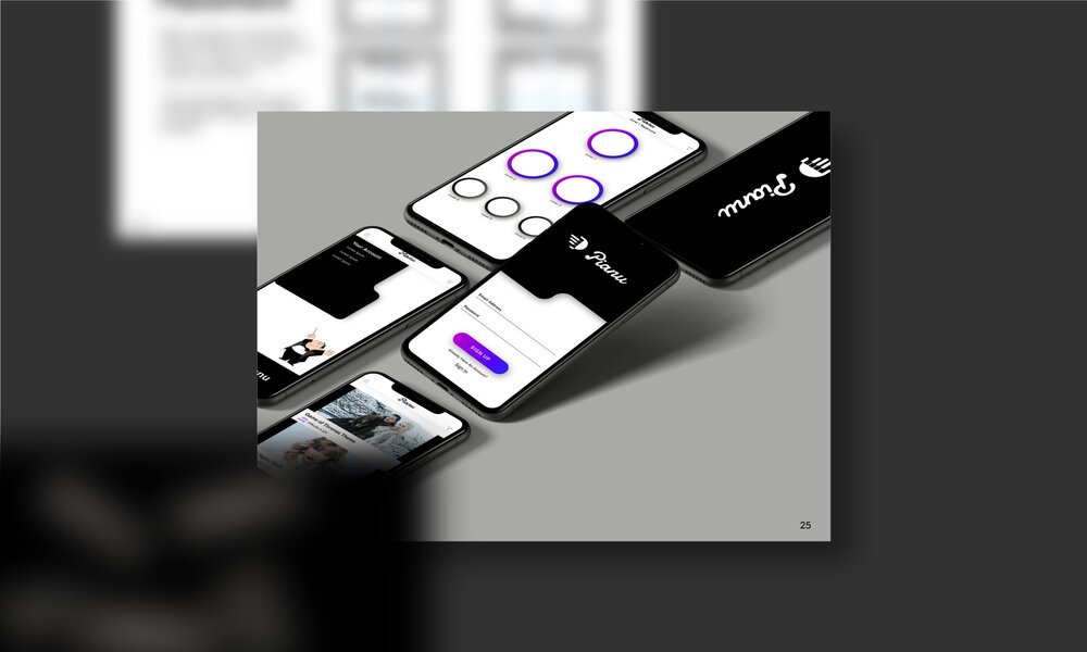
Web Design
Web Development
UI/UX Design
The pursuit of musical education for children can be a challenging endeavor for both parents and students. Learning a musical instrument requires dedication, practice, and patience, which can be difficult to sustain over time. Moreover, traditional music lessons present several challenges that can act as barriers to entry for parents and students.
The Challenge: Parents who want their children to learn music face a multitude of challenges, including finding the time to schedule lessons and locate quality instructors. Traditional music lessons require a significant time commitment, which can be a challenge for busy parents who have limited time to spare. Additionally, parents may struggle to find quality instructors in their area, which can limit their options for their child's musical education.
For students, the challenges of traditional music lessons are often related to the learning environment. Students may find traditional lessons monotonous and dull, which can make it difficult to maintain interest and motivation. The lack of engagement and fun in traditional music lessons can be particularly challenging for younger students, who may struggle to see the value in the skills they are learning.
The Solution: To overcome these challenges, Pianu provides an engaging and convenient alternative to traditional music lessons. Pianu is an educational music app that uses gamification strategies and design elements to create a unique and enjoyable piano learning experience. The app incorporates features such as badges, level-ups, and challenges to make learning fun and rewarding for students.
For parents, Pianu eliminates the need to schedule and transport their children to lessons, providing a convenient and accessible option for parents who want to provide their children with quality music education. Pianu's gamified approach to learning music also ensures that children are engaged and motivated to learn, making the process of learning a musical instrument both enjoyable and rewarding.
Conclusion: In summary, traditional music lessons present several challenges for parents and students, including time constraints and a lack of engagement and fun. Pianu provides a solution to these challenges by offering an engaging and convenient alternative to traditional music lessons. Pianu's gamified approach to learning music ensures that children are engaged and motivated to learn, making the process of learning a musical instrument both enjoyable and rewarding.

The Project Brief
Pianu approached us with the goal of enhancing their educational music app's brand identity and web design. As a company that uses gamification to teach users how to play the piano, Pianu needed a brand identity and web design that embodied their core values of making piano lessons fun, engaging, and rewarding.
To achieve this, we began by creating a comprehensive brand identity that included a new logo, brand guidelines, and consistent design elements across all platforms. Our goal was to ensure that Pianu's brand was recognizable and consistent across all touchpoints. We paid particular attention to the details, such as typography, color palette, and imagery, to create a cohesive and engaging brand identity.
Next, we focused on developing a web design that prioritized ease of navigation, readability, and an engaging layout. We designed the website to be visually appealing and user-friendly, allowing users to easily access all of the app's features. To keep the site engaging and approachable, we incorporated friendly and welcoming characters and design elements that were consistent with Pianu's brand identity.
Finally, we developed a comprehensive market strategy to help Pianu grow its brand and reach a larger audience. Our approach included targeted social media campaigns, search engine optimization, and email marketing campaigns that would increase awareness of the brand and drive new users to the app.
Overall, our work with Pianu resulted in a comprehensive brand identity and web design that embodied the company's values and mission. Our market strategy helped Pianu to increase its visibility and reach new users, ultimately contributing to the app's growth and success.
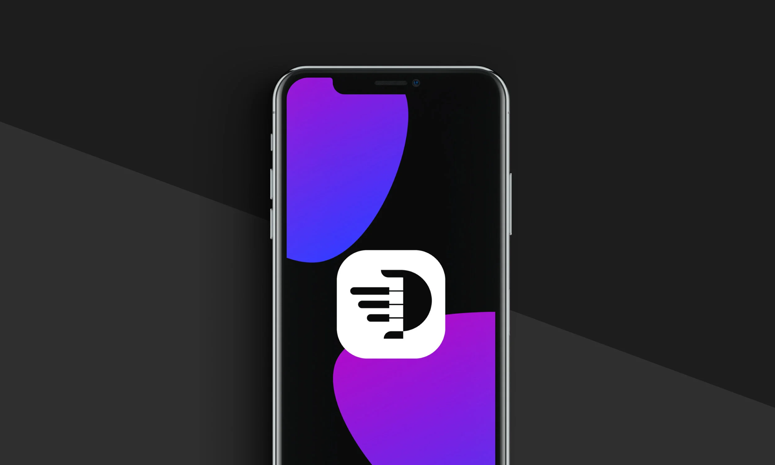

Logo Design
The logo consists of a brandmark and a wordmark, designed to be used separately or together to create a welcoming and fun brand identity. The brandmark is designed to appear as piano keys as well as a hand to represent the audience’s hands playing and learning piano. Following the hand concept, the wordmark is created with a hand written type, to appear friendly, engaging and personal. The soft edges on the brandmark and wordmark reinforce the appearance of a friendly and welcoming brand.

Creative Design
For the creative design aspect of the Pianu project, we leveraged Adobe Substance 3D design to develop the Pianu Pia Maestro Character. This character is an integral part of the brand identity, as we created multiple characters to be used across various Pianu platforms, including their website and app.
The main character, Pia, is a friendly and approachable maestro who serves as a mentor to Pianu's students. By incorporating Pia into the brand, we aimed to create a relatable and engaging experience for users, particularly younger audiences.
To make the learning process even more fun and rewarding, students can purchase different outfits for Pia using the coins they earn through completing challenges and reaching different levels. By gamifying the learning experience in this way, we aimed to further motivate and engage students, while also reinforcing the Pianu brand identity.


Brand Guidelines
As part of the project for Pianu, we developed a comprehensive brand identity that included a set of brand guidelines. These guidelines provided a framework for creating a consistent look and feel for the app's design elements across all platforms.
To start, we established the typography that would be used for headers and body copy throughout the website. We selected fonts that were both visually appealing and easy to read to ensure a positive user experience.
Additionally, we defined the interactive components that would be used in the design, such as buttons and switches, to ensure a cohesive and intuitive user interface. The design of these components was carefully considered to ensure they were both visually appealing and functional.
All of these design elements were documented in the brand style guide, which serves as a reference point for future design work. This ensures that any future design changes or updates will remain consistent with the established brand identity, helping to maintain a strong and recognizable visual presence for Pianu.


Pianu Colour Palette
Using traditional colours of a piano, black and white, we paired the two neutral colours with a vibrant and exciting purple-blue colour gradient. The gradient works well on a dark or light background, creating a bright contrast and creates movement for the eyes to follow. The secondary colours chosen are also bright and vibrant that can be used to add highlights and emphasis.
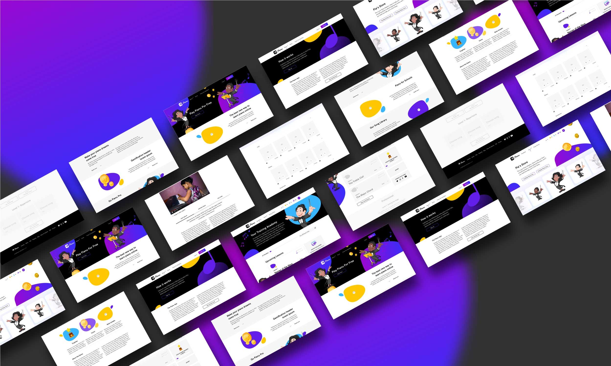
Homepage Website Design
The design of the homepage website is closely tied to Pianu's brand identity, and we strived to maintain a consistent look and feel throughout the website. To achieve this, we incorporated the Pianu color palette and design elements in the website design.
To make the website look fun and approachable, we used a minimalist approach with just the right amount of design elements. This helped keep the focus on the app's unique features, such as gamification strategies and rewards, which are aimed at making piano learning enjoyable for users.
The homepage design also aimed to create an emotional connection with the target audience. We used visually appealing images and videos, as well as relatable copy to engage users and help them see the benefits of using Pianu as an alternative to traditional piano lessons.
Overall, the design of the homepage was carefully crafted to be visually cohesive, emotionally engaging, and aligned with Pianu's core values of making piano learning fun and accessible.