A Guide to Creating The Brand Bible (With Examples)
03/30/2025
Brand Strategy

.png)


How to Create a Brand Bible: A Step-by-Step Guide With Examples



A brand bible is a reference document that brings together a company’s brand strategy, visual identity, messaging, and rules for using them. It gives employees and external partners the instructions, examples, and approved assets they need to represent the business consistently.
To create a brand bible, define who will use it, gather approved brand materials, organise the contents, write clear usage rules, and show those rules in practice. Then test the document, approve and distribute it, and assign responsibility for updates.
This guide takes you through that process step by step. You will find real brand examples, a copyable brand bible template, and a release checklist. The aim is a document that helps someone complete a task, from choosing the right logo to writing a customer email.
Why Create a Brand Bible?
A brand bible makes approved brand decisions easier to find and apply. It becomes especially useful when several people create content, a new employee joins, or an agency or supplier needs to produce work on your behalf.
Start with the questions that repeatedly interrupt projects. Your guide should give clear answers to questions such as:
- Which logo version works on this background?
- What should this audience understand first?
- Which claims have supporting evidence?
- What can we change in this template?
- Who approves an exception?
Consistency comes from making these choices usable. A guide can reduce avoidable confusion, but its value depends on whether the instructions are clear, the assets are accessible, and the business delivers what its messaging promises.
Little Tandem: Connect Brand Strategy to Everyday Applications
For Little Tandem, The Branded Agency connected a positioning centred on childhood growth and belonging with a logo system, colours, illustrations, messaging, packaging, and website design. The project’s guideline pages show how the identity is documented for use across those applications.
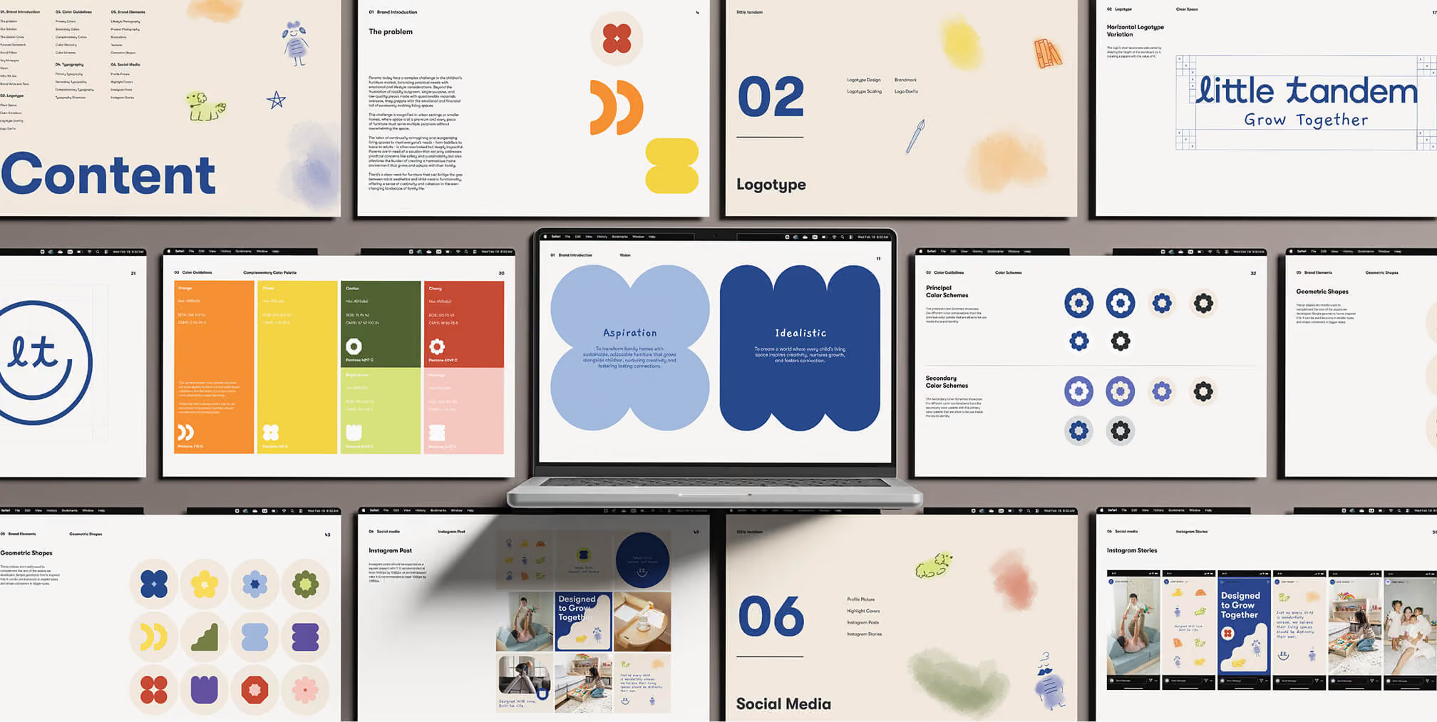
The examples below connect individual design choices to finished work. In your own brand bible, explain how to combine the logo, typography, imagery, and message so the next designer can create a new application without simply copying an old layout.
Brand Bible vs. Brand Guidelines, Brand Platform, and Style Guide
“Brand bible,” “brand book,” and “brand guidelines” often describe overlapping resources. There is no universal rule that one must be longer or more strategic than another. Define the scope of your document clearly so people know what it contains.
A brand platform records the strategic foundations: who the brand serves, what it stands for, how it is positioned, and what it promises. A brand bible uses those approved decisions to explain how the business should communicate and present itself.
A visual style guide concentrates on design rules, such as logo usage, colour, typography, and imagery. A broader brand bible can also cover messaging, voice, templates, approvals, and maintenance. Keep detailed product-interface components in a connected design system when your team maintains one.
How to Create a Brand Bible in 8 Steps
Build the document around the people and decisions it needs to support. The eight steps below take you from defining the scope to releasing an approved guide and keeping it current.
Start by reviewing what brand guidelines should include, then use the step-by-step build checklist below to assemble those elements into a practical document.
Step 1: Define the Users, Scope, and Priority Tasks
List who will use the brand bible and what they need to do. A designer preparing packaging needs production detail; a salesperson editing a proposal needs approved messages and templates; a support team needs language for common customer situations.
Ask each group where uncertainty causes delays or revisions. Use their answers to decide what belongs in the first release. A small business may need a concise guide, while a company with multiple product lines, regions, or partners may need specialist sections.
Your output: A short brief naming the intended users, priority tasks, sections in scope, project owner, and final approver.
Step 2: Audit Your Approved Strategy and Brand Assets
Collect your positioning, audience research, core messages, logos, colours, typography, image assets, writing guidance, and commonly used templates. Identify the approved master version of each item and separate it from drafts and retired files.
Resolve strategic gaps before turning them into rules. Your brand positioning should explain the audience, available alternatives, relevant difference, customer benefit, and supporting evidence. Customer research and feedback from sales and support can help test those decisions.
Record missing items with an owner and a next action. Approved sections can move forward while other decisions are being developed, but unfinished material should stay clearly labelled as draft.
Your output: An approved source collection and a list of missing decisions, assets, and responsible owners.
Step 3: Organise the Brand Bible Around Real Decisions
Create a contents structure covering brand foundations, messaging and voice, visual identity, applications, asset access, and document management. Put the guidance people use most often within easy reach.
Use descriptive headings and a linked contents list in longer documents. Keep instructions, examples, and asset links together. Someone searching for the correct logo on a dark background should find the rule and the corresponding file in the same section.

Paren guidelines document logo applications, typography, colour, and gradient treatments.
Annotate the examples. Identify what users may change, such as the headline, photograph, or product information, and what must stay within approved rules, such as logo proportions, clear space, or font roles.
Step 4: Write Specific Rules and Do-and-Don’t Examples
Replace vague directions with decisions people can follow. Instead of “keep it clean,” explain the layout hierarchy, spacing, image treatment, and approved colour combinations. Show which elements are fixed and which can change.
For writing, explain the brand’s consistent voice and how its tone adapts to different situations. Pair each principle with an appropriate example, an unsuitable example, and an explanation of where the rule applies.
Hypothetical example: a service brand with a clear, helpful voice.
- Principle: Make the next step easy to understand.
- Do: “Send us your project brief, and we will explain the next steps.”
- Avoid: “Unlock limitless possibilities with our transformative solutions.”
- Use it in: Enquiry forms, onboarding emails, and customer support replies.
Your output: Practical rules supported by examples, boundaries, and links to the approved materials.
Step 5: Add Brand Applications and Editable Templates
Show the identity in formats your team actually produces, such as website pages, social posts, presentations, packaging, and customer emails. Include editable templates where people need to create new work regularly.
Our Paren project connects geometric forms, typography, and a bright colour system across brand documentation and public-facing materials. The guideline pages and posters below illustrate how one identity can support several layouts.

Paren posters demonstrate different layouts within a shared visual identity.
Your output: Annotated applications and editable templates that explain both the intended result and the choices behind it.
Step 6: Test the Document and Record Approval
Ask someone who did not write the guide to complete a realistic task using only the document and its asset links. For example, have them prepare a presentation slide or draft a support reply. Record where they hesitate, use the wrong file, or need clarification, then revise the guidance.
Have design leads review visual rules, communication leads review messaging and tone, and relevant business owners check claims and permissions. Name one release approver. Record which version they approved and resolve outstanding issues before presenting it as final.
Your output: A tested document, recorded sign-off, and an approved release version.
Step 7: Publish, Distribute, and Introduce the Guide
Choose one maintained location for the current brand bible. A searchable online guide or shared document suits frequent updates; a PDF can provide an offline reference. Keep downloadable copies linked to the maintained source and current asset collection.
Check that employees and authorised external partners can access the materials they need. Keep restricted strategy and working files separate from public assets. Introduce the guide through a short walkthrough, add it to onboarding, and show users how to request help or an exception.
Your output: A shared source, tested access, a distribution plan, and a named contact for questions.
Step 8: Assign Ownership and Maintain Version History
Assign a document owner to coordinate changes and identify section owners where specialist review is needed. Display the current version, approval date, change summary, and review responsibility so readers can tell which guidance applies.
Update the guide when positioning, identity, products, claims, channels, or team needs change. Revise related assets and templates at the same time, notify affected users, and archive superseded files. Explain whether a change affects all future work or only a specific application.
Your output: A repeatable process for requesting, reviewing, approving, and communicating updates.

Free Brand Health Audit
Make sure your brand is built to sell

What should a brand bible include?


A practical brand bible covers six areas: brand foundations, messaging and voice, visual identity, applications, approved assets, and ownership. Use the contents below to build your document, adding detail where it helps someone make a real decision.
1. Brand Foundations and Positioning
Summarise the approved strategy in language that a new employee or partner can understand:
- Audience: Who you serve, what matters to them, and the needs your offer addresses.
- Positioning: The category, alternatives, relevant difference, customer benefit, and supporting evidence.
- Purpose: The contribution your business exists to make.
- Mission: What you do, for whom, and how you deliver it.
- Vision: The future your organisation is working toward.
- Values: Principles expressed through observable decisions and behaviours.
- Brand pillars: The themes you consistently demonstrate through products, service, and communication.
Connect each brand pillar to proof and behaviour. If “helpful” is a pillar, explain how it appears in service and communication: clear options, useful instructions, and an accessible route to support.
2. Messaging, Brand Voice, and Tone
Record the core message, audience-specific benefits, supporting evidence, personality traits, and writing conventions. Explain what people should understand about the brand before deciding how to phrase it.
For each important claim, identify the intended audience, customer benefit, approved wording, evidence source, and review owner. Keep evidence accessible so writers can check a statement before reusing it.
Distinguish the strategic message from a tagline. A tagline is an optional short expression; it does not replace the explanation of what you offer and why it matters. Keep the brand voice recognisable while adapting tone to situations such as a launch, a delay, or a complaint.
Use brand voice guidelines to document terminology, product names, spelling, capitalisation, and practical do-and-don’t examples. Include guidance on what to say when the team does not yet have a confirmed answer.
3. Visual Identity and Usage Rules
Document the approved visual elements, explain how to use them, and link to the correct files:
- Logos: Versions, minimum sizes, clear space, backgrounds, lockups, and incorrect applications.
- Colour: Values for relevant media, colour roles, gradients or tints, and approved combinations.
- Typography: Fonts, weights, hierarchy, spacing, fallback fonts, and licensing or access information.
- Photography and illustration: Subjects, composition, treatment, crop examples, and usage rights.
- Icons and graphic elements: Style, proportions, patterns, shapes, and appropriate applications.
- Layout: Grids, alignment, spacing, and how text and imagery work together.
For digital colour pairings, document tested combinations that meet the relevant WCAG text-contrast requirements. Text within logos and logotypes is exempt from that particular criterion; ordinary headings, body copy, and button labels using brand colours are not.
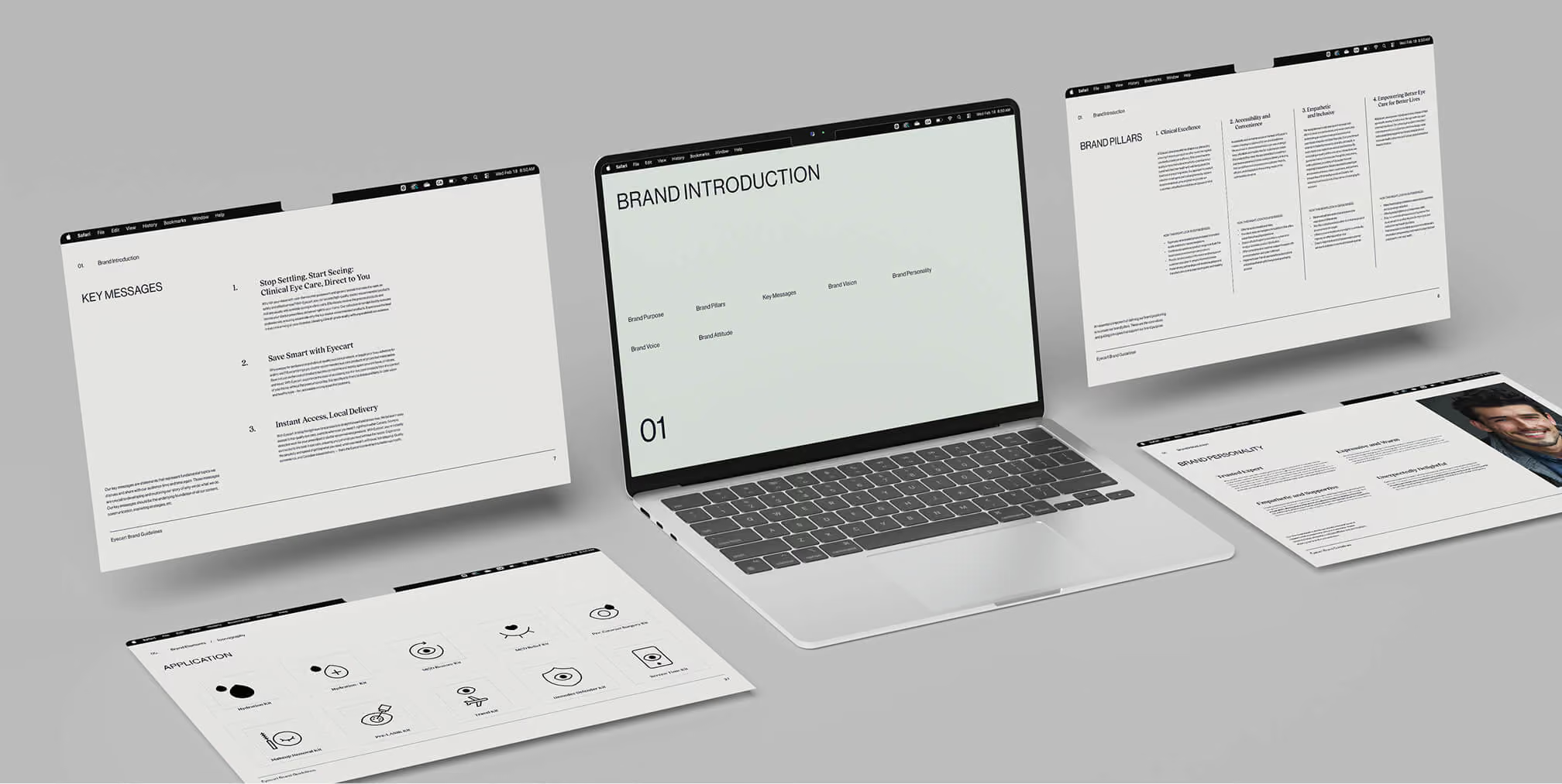

Eyecart campaign layouts demonstrate how the identity adapts to outdoor advertising.
4. Applications and Editable Templates
Include examples for priority formats: product pages, presentations, social posts, packaging, advertisements, proposals, emails, and signage. Choose the applications that reflect how your business actually communicates.
For each template, state its purpose, editable fields, fixed elements, master-file location, and any review requirement. Use realistic content so people can see how text length, imagery, and information hierarchy work together.

5. Approved Assets, Permissions, and Access
Identify each asset’s name, intended use, format, current version, and source location. Record relevant font, photography, illustration, or partner-brand permissions alongside the files.
Link to approved logos, fonts, images, and editable templates. Give users a contact for missing formats or access problems, and separate retired files from current assets. A useful rule should lead to a usable file.
6. Ownership, Approvals, and Version History
Record the document owner, section reviewers, release approver, current version, approval record, and change history. Explain which changes need review, who can approve an exception, and how updates reach the people using the guide.
Make these details easy to find. A well-designed document can quickly become unreliable if its asset links fail or nobody is responsible for keeping its instructions current.
Arkhai: Explain How Distinctive Brand Elements Work Together
Our Arkhai identity project combines a geometric brandmark, technical typography, gradients, and code-inspired patterns. The guideline spreads document the supporting visual elements that make the system recognisable beyond the logo.
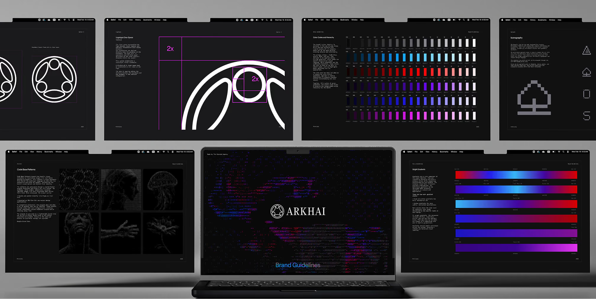
Apply the lesson: Use a familiar application to explain the relationships between elements. A business card can show logo scale, typographic hierarchy, colour treatment, and background pattern in one example.

Want to learn more about brand platforms, Brand Strategy and Brand Identity? Keep reading!
Brand Bible Examples: What to Learn From Real Documents

The examples below combine excerpts from The Branded Agency’s client work with public brand resources. The case studies show selected guideline pages and applications. The public resources have specific scopes; each offers a practical lesson for building your own guide.
Influry: Connect Identity Rules to Campaign Applications
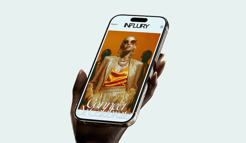
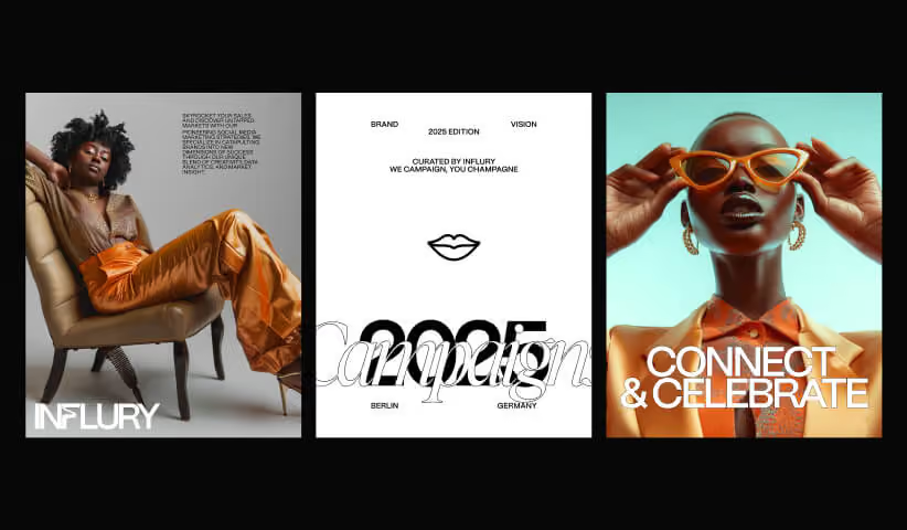
For Influry, The Branded Agency developed a distinctive wordmark, a black-and-white identity with orange accents, and editorial photography. These elements provide a useful example of documenting both a recognisable brandmark and the wider visual language used around it.
We'll look at five different brand bible examples, from Twitter to Apple.
It can be overwhelming to start a brand bible, but we hope this post will give you ideas and brand guidelines on how to start and what to include.
For some help in creating a brand bible, finding a branding agency can be the next step in your branding journey. Let's take a look at some examples.
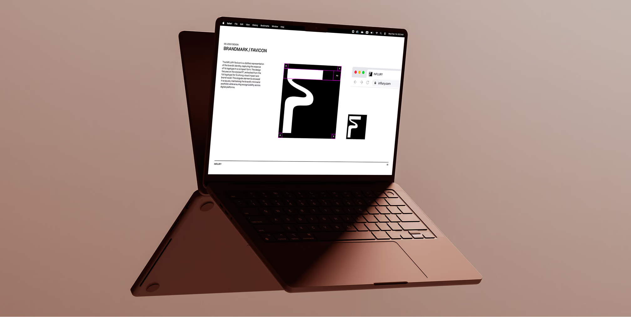
Influry brandmark and favicon documentation show how smaller identity elements are specified.
Apply the lesson: Include the component rules and finished examples. Explain how typography, colour, photography, and messaging combine, and show the flexibility that allows new campaigns to remain recognisable.

For website applications, show how the identity adapts to different screen sizes. Add instructions for image cropping, heading hierarchy, and content priority so a desktop example can inform a smaller layout.
Bomi 365: Document a Consistent Packaging System
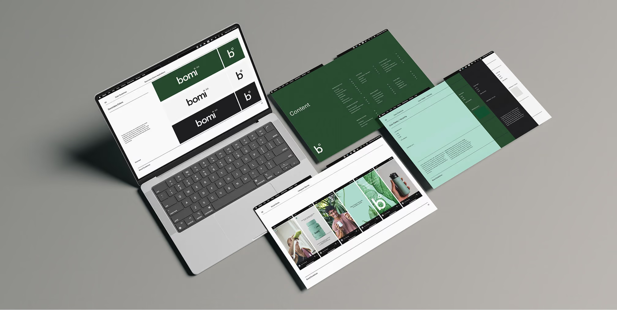
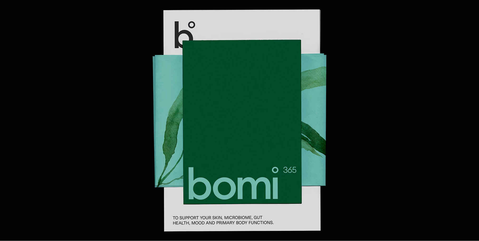
Our Bomi 365 branding and packaging project uses mint and darker green tones, structured typography, and watercolour ingredient illustrations. The case study shows the identity across packaging and supporting communication, giving teams a concrete reference for related applications.
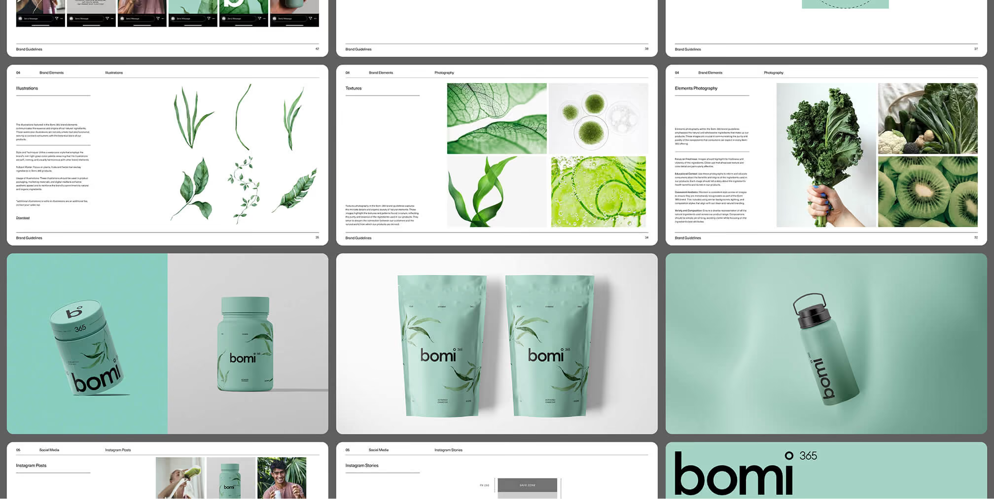
Apply the lesson: Show how the system handles different formats. Explain the roles of product names, information hierarchy, illustrations, and colour so new packaging belongs to the same brand without making every item identical.
Photography guidance should be practical too. Show the composition, backgrounds, lighting, and product placement that establish a consistent direction for future shoots.
Treat design approval and claim approval as separate decisions. A product statement needs supporting evidence and the appropriate review even when it fits the approved layout and tone.
Slack: Make Approved Brand Assets Easy to Find
Slack’s media kit provides access routes for logos and product screenshots, with information about brand and trademark use. It illustrates the asset-access layer of brand documentation: helping people find approved materials for a defined purpose.
Apply the lesson: Keep external asset collections distinct from internal strategy and working files. State who the resources are for, what uses are covered, and where partners can ask questions.
Apple: Define the Scope of Each Guideline Document
Apple’s App Store marketing guidelines cover badges, product imagery, photography and video, messaging, and related requirements for promoting apps. This is a focused marketing resource, rather than a public copy of Apple’s complete corporate brand bible.
Apply the lesson: State the audience and permitted applications at the start. A partner guide, packaging supplement, or campaign reference should explain which decisions it governs and where broader brand rules apply.
Historical Twitter Materials: Label Retired Branding Clearly
Twitter guides featuring the blue bird, former name, and “Tweet” terminology are historical brand references. Study them as examples of past documentation, rather than treating them as current instructions for X.
The legacy Twitter brand toolkit illustrates why the contents of a resource matter more than its URL alone. For your own guide, label retired editions clearly, separate them from current assets, and direct users to the owner who can confirm the approved version.
Copyable Brand Bible Template

Sloane Avery
Want to learn more about brand platform?