Marketing Dashboard Metrics That Actually Drive Decisions
09/17/2026
Marketing Services
A guide to marketing dashboard metrics — the decision-first framework, dashboard types by audience, data source connectors, and common mistakes to fix.

Every marketing dashboard should anchor on one revenue-tied North Star metric, supported by 3-5 KPIs per funnel stage, selected through a single repeatable test: Does this number change a decision? According to a decision-first dashboard playbook, leaders who report revenue-grade metrics are significantly more likely to receive credit for marketing's contribution to the business. That one statistic reframes the entire exercise. A dashboard is not a data repository. It is an opinionated tool that answers "Are we on track?" for a specific audience, at a specific cadence.
.png)


What Metrics to Track by Funnel Stage: Awareness Through Retention

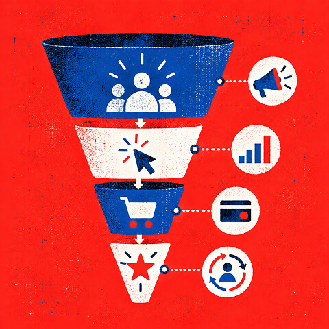

Before you add a single tile, run every candidate metric through this framework:
Decision → Owner → Frequency → Data source → Threshold
If you cannot fill in all five fields, the metric does not belong on the dashboard.
Every executive-level dashboard should carry at least these six headline metrics:
- Revenue influenced by marketing (pipeline or closed-won attributed to marketing)
- Customer acquisition cost (CAC) by channel
- Marketing-sourced pipeline (dollar value of opportunities created)
- Return on ad spend (ROAS) across paid programs
- Lead-to-opportunity conversion rate from CRM
- Customer lifetime value (LTV) or LTV:CAC ratio
Pro Tip: Before your next dashboard review, ask each stakeholder: "If this metric doubled overnight, what would you do differently?" If the answer is "nothing," remove the tile.
Key Takeaways
The most effective marketing dashboards anchor on one revenue-tied North Star, attach thresholds and owners to every KPI, and remove any metric that cannot change a decision.
| Point | Details |
|---|---|
| Decision-first framework | Every KPI must map to a specific decision, a named owner, a cadence, a data source, and a threshold. |
| Revenue-grade metrics | Reporting pipeline, CAC, and ROAS makes marketing roughly 1.8x more likely to earn credit for its contribution. |
| Optimal KPI count | Track 10-15 KPIs overall; limit executive views to 6 headline tiles with drill-downs for detail. |
| Build order matters | Automate connectors first, then define metrics, then set refresh schedules, then configure alerts. |
| The Branded Agency | Delivers end-to-end dashboard builds, from decision mapping and metric dictionaries to validated prototypes and governance handoffs. |
What marketing dashboard metrics should you actually track?
The most useful way to organize your KPI catalogue is by funnel stage and channel, not by platform. Platforms change. Business decisions do not. Below is a practical inventory organized from awareness through retention, with the data sources and visualization types that make each metric readable.
Awareness metrics
| Metric | Formula / Definition | Question Answered | Data Source | Visualization | Target Guidance |
|---|---|---|---|---|---|
| Impressions | Total ad or content views | Are we reaching enough of the market? | Google Ads, Meta Ads Manager | Trend line | Set from historical baseline; compare to prior period |
| Share of voice (SOV) | Brand impressions ÷ total category impressions | How visible are we vs. competitors? | SEMrush, Google Ads auction insights | Single-number tile | Aim to match or exceed market share |
| Branded search volume | Monthly searches for brand name | Is brand awareness growing? | Google Search Console, GA4 | Trend line | Track directional growth month over month |
Acquisition metrics
| Metric | Formula / Definition | Question Answered | Data Source | Visualization | Target Guidance |
|---|---|---|---|---|---|
| Cost per click (CPC) | Ad spend ÷ clicks | Are we paying a fair price for traffic? | Google Ads, Meta Ads Manager | Trend line with goal | Set from channel benchmarks; refine with multi-week average |
| Click-through rate (CTR) | Clicks ÷ impressions x 1 | Is our creative compelling enough? | Google Ads, Meta Ads Manager | Trend line | Search: 3-5%; Display: 0.35-0.5% |
| Sessions by channel | GA4 session count segmented by source/medium | Which channels drive the most traffic? | GA4 (Google Analytics) | Stacked bar or table | Compare to prior period and goal |
| CAC | Total marketing spend ÷ new customers acquired | What does it cost to win a customer? | Salesforce, HubSpot, finance | Single-number tile | Must be below LTV; set by channel |
Consideration and conversion metrics
| Metric | Formula / Definition | Question Answered | Data Source | Visualization | Target Guidance |
|---|---|---|---|---|---|
| Lead volume | Count of MQLs or SQLs | Are we generating enough pipeline? | HubSpot, Salesforce | Trend line | Set from revenue model backward |
| Lead-to-opportunity rate | Opportunities ÷ leads | Is lead quality improving? | Salesforce, HubSpot | Funnel | Benchmark against prior quarter |
| Conversion rate | Conversions ÷ sessions | Is the site or landing page working? | GA4, Google Ads | Trend line with goal | E-commerce: 1-3%; B2B: 2-5% |
| ROAS | Revenue ÷ ad spend | Are paid programs profitable? | Google Ads, Meta Ads Manager | Single-number tile | Minimum 3x for most B2B programs |
| Marketing-sourced pipeline | Dollar value of open opportunities from marketing | How much revenue is marketing building? | Salesforce, HubSpot | Single-number tile | Align to revenue target |
Retention metrics
According to best-practice guidance, tracking 10-15 KPIs overall is the right ceiling, with real-time monitoring reserved for paid media and benchmarks set from historical performance before leaning on industry averages.
Free Brand Health Audit
Make sure your brand is built to sell
Search has changed. Your customers aren't just Googling anymore. They're asking ChatGPT, Perplexity, Gemini and other AI platforms what to buy, who to trust and which brands they should consider.
If your brand isn't showing up clearly in those answers, you're already losing opportunities. Our free Brand Health Audit shows you where your brand stands across traditional search, AI search and brand positioning.

Sample brand audit
Live preview
Traditional search
72
AI search (GEO)
34
Brand positioning
58
The 5 Dashboard Types High-Performing Teams Use, by Audience and Cadence
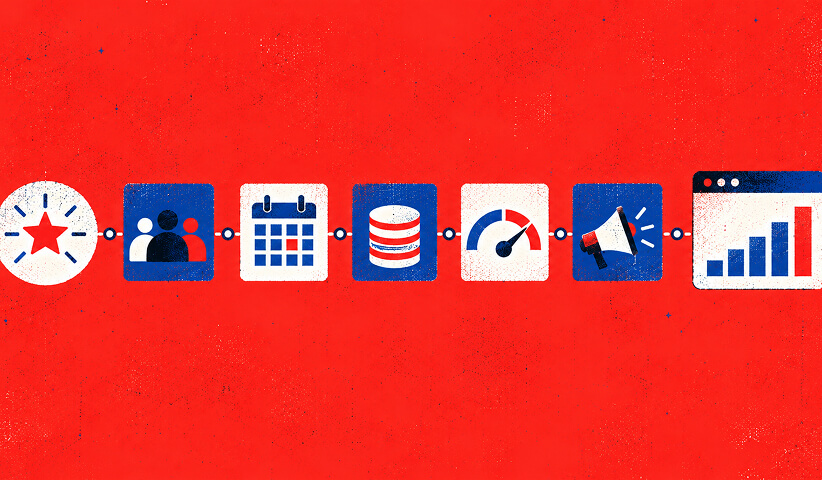
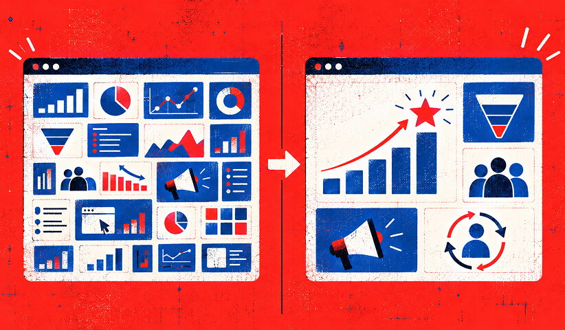


What types of marketing dashboards do high-performing teams use?
The dashboard type determines which metrics to surface and at what cadence. Mixing audience types on one screen is one of the fastest ways to make a dashboard useless. Example galleries show templates for CMO dashboards, digital marketing dashboards, web analytics dashboards, and social monitoring dashboards that teams can adapt without starting from scratch.
Executive / CMO scorecard
Primary question: Is marketing contributing to revenue on plan?
Refresh cadence: weekly or monthly. Tiles to include:
- Marketing-sourced pipeline ($)
- CAC by channel
- LTV:CAC ratio
- ROAS (blended)
- MQL volume vs. target
- Revenue influenced by marketing ($)
Keep this view to six tiles maximum. Every number should reconcile to the finance system. One revenue-tied North Star at the top builds trust with CFOs and boards faster than any slide deck.
Paid acquisition dashboard
Primary question: Where should we shift budget today?
Refresh cadence: daily or near-real-time for active campaigns. Tiles to include:
- Spend by channel (Google Ads, Meta Ads Manager)
- ROAS by campaign
- CPC and CTR trend
- Conversion rate by ad set
- Cost per lead (CPL) vs. target
This is the dashboard your paid media team lives in. Anomaly highlighting on ROAS and CPL tells the team exactly when to pause a campaign or reallocate budget.
SEO and content dashboard
Primary question: Is organic traffic growing and converting?
Refresh cadence: weekly for traffic, monthly for rankings. Tiles to include:
- Organic sessions (GA4)
- Keyword rankings by cluster (Google Search Console)
- Branded vs. non-branded search split
- Organic conversion rate
- Top landing pages by session and goal completion
SEO moves slowly. A weekly trend line over a 13-week rolling window shows signals through the noise better than a month-over-month comparison.
Email and retention dashboard
Primary question: Is our audience engaged and coming back?
Refresh cadence: after each send, then weekly rollup. Tiles to include:
- Open rate and click-to-open rate (CTOR)
- Unsubscribe rate
- Revenue per email sent
- Repeat purchase rate
- Churn rate trend
Social media dashboard
Primary question: Is our content building an audience that converts?
Refresh cadence: daily for paid social, weekly for organic. Tiles to include:
- Reach and impressions by platform
- Engagement rate (likes + comments + shares ÷ reach)
- Follower growth rate
- Paid social CPL and ROAS
- Link clicks to site
Drowning in 40 dashboard tiles but still can't make a call? Keep reading!
If you need a dashboard built around decisions instead of available data, contact us for a free custom quote.
Choosing the Right Metrics, and What Makes a Dashboard Actually Readable

How do you decide which metrics belong on your dashboard?
Most marketing dashboards track 30-50 metrics. Most decisions get made using three. That gap is where dashboards lose credibility. The fix is a decision-first build, not a data-first one.
Step-by-step framework
- List your three most frequent decisions. Examples: "Should we increase paid budget?" "Is this campaign worth continuing?" "Which channel gets next quarter's investment?" Write them down before touching any data.
- Map each decision to a metric owner. Every KPI needs a named person who acts on it. If no one owns the metric, it is a reporting metric, not a decision metric. Move it to a drill-down or remove it.
- Select 3-5 KPIs per decision. More than five KPIs per decision creates analysis paralysis. Fewer than three risks missing a key signal. Pick the minimum set that would change the decision.
- Attach a threshold to each KPI. A metric without a threshold is just a number. Define the intervention point: "If ROAS drops below 2.5x, we pause the campaign." This is what separates a dashboard from a report.
- Define the calculation and data source. Ambiguous definitions destroy trust. Write the formula, the source system, and the attribution window in a metric dictionary before building a single tile.
- Set the refresh cadence. Paid media: daily or real-time. Campaign ops: daily. SEO and content: weekly. Executive scorecard: weekly or monthly. Mismatched cadence is one of the most common reasons dashboards go stale.
Red flags: metrics that usually fail the decision test
- Pageviews without a conversion context
- Social followers as a standalone metric
- Email opens without CTOR or revenue per send
- Impressions on a conversion dashboard
- "Engagement" without a clear definition tied to business outcome
Pro Tip: Run a two-week audit. For every tile on your current dashboard, ask the owner: "Did you use this number to make a decision in the last 14 days?" Tiles that get a "no" are candidates for removal.
What makes a marketing dashboard actually readable?
A dashboard that requires a five-minute orientation every time someone opens it has already failed. Design is not decoration here. It is the difference between a tool people trust and a report they ignore.
Checklist for readable, decision-ready dashboards:
- 4-6 headline tiles at the top. Supporting detail lives one click down, not on the main view. Dashboards that try to show everything become noise.
- Consistent date context on every tile. Every metric should display its comparison period (vs. prior period, vs. goal, vs. same period last year). A number without context is uninterpretable.
- Goal lines on every trend chart. A trend line without a goal line tells you direction but not whether you are winning. Add the target as a horizontal reference line.
- Color used only for alerts. Red/amber/green status indicators work when they are reserved for threshold breaches. Using color decoratively trains viewers to ignore it.
- One metric per tile. Combining two metrics on a single tile forces the viewer to do math. Keep tiles atomic.
- Accessibility check. Use colorblind-safe palettes (avoid red/green alone) and add text labels to charts so screen readers can parse them.
Visualization guide
- Single-number tile: Use for North Star metrics and KPIs with a clear target. Shows current value, comparison delta, and status at a glance.
- Trend line: Use for metrics that move over time (sessions, pipeline, ROAS). Add a goal line and a 13-week rolling average for context.
- Funnel chart: Use for conversion rate analysis across stages. Shows where volume drops and where to focus optimization.
- Table: Use for channel or campaign breakdowns where ranking matters. Sort by the most important column by default.
- Anomaly highlighting: Flag data points that breach a threshold automatically. This is especially useful on paid media dashboards where a CPC spike needs same-day action.
Data Sources, Build Process, Common Mistakes, and Why Fewer Metrics Win

Which data sources should you connect, and how do you keep them clean?
A well-built KPI dashboard reconciles spend, sessions, and revenue from ad platforms, web analytics, and CRM so your team can show which channels actually made money. That reconciliation is the hardest part of any dashboard build, and it is where most teams cut corners.
Primary connectors to integrate
- GA4 (Google Analytics): Sessions, conversions, goal completions, user behavior, and attribution paths. The foundation of any web-based measurement plan.
- Google Ads: Spend, impressions, clicks, CTR, CPC, conversions, and ROAS by campaign and ad group.
- Meta Ads Manager: Paid social spend, reach, CPM, CPL, ROAS, and frequency. Requires careful attribution window alignment with GA4.
- HubSpot: MQL and SQL volume, lead-to-opportunity rates, email performance, and lifecycle stage progression.
- Salesforce: Pipeline value, closed-won revenue, opportunity source, and CAC calculations tied to finance.
Data quality checks to run before launch
- Spend reconciliation: Does the spend figure in your dashboard match the invoice from Google Ads and Meta? A 5% variance is a red flag.
- Session-to-lead reconciliation: Do GA4 sessions align with HubSpot form submissions within a reasonable margin? Large gaps indicate tracking gaps or duplicate form submissions.
- Attribution window alignment: Are Google Ads, Meta Ads Manager, and your CRM all using the same attribution window (7-day click, 1-day view, etc.)? Misalignment inflates or deflates channel credit.
- Null and duplicate checks: Run a weekly query to flag null values in key fields and duplicate lead records in Salesforce or HubSpot.
Connector checklist
- First-party event capture confirmed in GA4 (key events firing correctly)
- CRM lifecycle stages mapped to funnel stages in the metric dictionary
- Spend imports automated from Google Ads and Meta Ads Manager
- Scheduled reconciliation report running weekly
- Attribution model documented and shared with all stakeholders
According to build-order guidance, the right sequence is: automate data collection first, then define the metric layer, then set refresh and delivery schedules, then configure alerting. Teams that skip to alerting before connectors are stable end up with noisy, untrusted dashboards.
Attribution callout: Document your attribution model in the metric dictionary before you build. Whether you use last-click, first-click, linear, or data-driven attribution in GA4, every stakeholder needs to know which model the dashboard uses and why. Changing the model mid-flight without documentation is one of the fastest ways to lose executive trust.
How do you build a marketing dashboard from brief to launch?
The build itself follows a predictable sequence. Teams that skip discovery and jump straight to visualization spend weeks rebuilding tiles that stakeholders never use.
- Discovery: map decisions and stakeholders. Interview each dashboard audience (CMO, paid media manager, content lead). Document their three most frequent decisions, the metrics they currently use, and the questions those metrics fail to answer. Deliverable: a decision map with named owners.
- Metric dictionary: define every KPI. For each metric: write the formula, the data source, the attribution window, the refresh cadence, and the intervention threshold. No tile gets built without a dictionary entry. Deliverable: a shared metric dictionary (a spreadsheet or Notion doc works).
- Data engineering: build and validate connectors. Connect GA4, Google Ads, Meta Ads Manager, HubSpot, and Salesforce. Run reconciliation checks against platform-native reports and finance. Deliverable: a validation report showing variance by source.
- Prototype: build the first draft. Start with the executive scorecard. Use the metric dictionary to populate tiles. Show the prototype to one stakeholder before sharing broadly. Deliverable: a reviewed dashboard prototype.
- Validation: run anomaly and threshold tests. Inject a known data anomaly (a date range with a known spike) and confirm the dashboard flags it correctly. Verify that threshold alerts fire at the right values. Deliverable: a signed-off validation checklist.
- Launch and training. Walk each audience through their dashboard in a 30-minute session. Document how to interpret each tile and what action each threshold triggers. Deliverable: a governance handoff document.
- Iteration: quarterly metric review. Schedule a quarterly review to retire metrics that no longer drive decisions and add new ones as business priorities shift. A dashboard that never changes is a dashboard that has stopped being used.
Before launch, confirm three things: spend reconciles to platform invoices, lead volume reconciles to CRM, and every threshold has a named owner who has agreed to act on it.
What does the research say about common dashboard mistakes?
The most persistent mistake is building dashboards around available data rather than around decisions. Practitioner evidence shows that starting with the three most frequent decisions and five supporting KPIs consistently produces dashboards that get used. Starting with a data export produces dashboards that get ignored.
Common mistakes and concrete fixes
| Mistake | Why It Fails | Fix |
|---|---|---|
| Metric overload (30+ tiles) | Viewers cannot identify what to act on | Cut to 8-12 tiles; move detail to drill-downs |
| No intervention thresholds | Teams watch numbers move without knowing when to respond | Attach a threshold and owner to every operational KPI |
| Data-first build | Dashboard reflects what is easy to pull, not what drives decisions | Start with decision mapping before touching data |
| No reconciliation to finance | CFOs distrust marketing numbers | Reconcile pipeline and revenue to Salesforce and finance weekly |
| Stale manual reports | Numbers are out of date by the time they are read | Automate connectors; set scheduled refresh |
| Vanity metrics on executive view | Impressions and follower counts do not answer revenue questions | Replace with pipeline, CAC, and ROAS |
| Undefined metric calculations | Two people read the same number differently | Write a metric dictionary before building |
Teams that report revenue-grade metrics, such as marketing-sourced pipeline and CAC, are roughly 1.8x more likely to earn credit for marketing's contribution, according to the same decision-first playbook. That is not a soft benefit. It translates directly into budget authority and organizational influence.
The case for fewer, sharper metrics
There is a version of this conversation that gets skipped in most dashboard guides: the political one. Dashboards are not neutral. Every metric you put in front of a CFO or a board is a claim about what marketing is worth. Impressions and engagement rates are not claims. They are deflections. Pipeline value, CAC, and ROAS are claims. They are the metrics that get marketing a seat at the revenue table.
The teams we see struggle most with dashboards are not the ones with bad data. They are the ones with too much of it, presented without a point of view. A dashboard that shows 40 metrics is not comprehensive. It is a way of avoiding accountability for any single number.
The decision-first framework is not just a design principle. It is a forcing function that makes you choose what you actually believe about your marketing program. When you attach a threshold to a metric and a name to that threshold, you are making a commitment. That commitment is what separates a marketing team that influences decisions from one that produces reports.
The most credible dashboards we have seen share one trait: they are opinionated. They say, "This is the number that matters this quarter, this is where it needs to be, and this is who is responsible." Everything else is context.
What The Branded Agency delivers for marketing teams that need a dashboard built right
Building a dashboard that earns executive trust takes more than connecting a few APIs. The Branded Agency delivers the full engagement: stakeholder discovery and decision mapping, a metric dictionary your finance team can audit, connector engineering across GA4, Google Ads, Meta Ads Manager, HubSpot, and Salesforce, and a validated dashboard prototype with governance documentation.
Most engagements move from discovery to a working prototype in four to six weeks, with a governance handoff and training session included. For teams running paid media programs, we layer in real-time ROAS and CPL alerting so budget decisions happen in hours, not at the end-of-month review. If you want to know which of your current dashboard tiles are actually driving decisions, request a dashboard audit and we will show you exactly where to cut and what to add.
Sources
- Marketing Dashboard KPIs: A 2026 Decision Playbook
- Marketing KPI Dashboard: Build One That Works | ObserviX
- Marketing Dashboard KPIs: Track What Matters in 2026 | 1ClickReport
- A comprehensive guide to marketing dashboards
- 11 Marketing dashboard examples
Recommended

Quincy Samycia
As entrepreneurs, they’ve built and scaled their own ventures from zero to millions. They’ve been in the trenches, navigating the chaos of high-growth phases, making the hard calls, and learning firsthand what actually moves the needle. That’s what makes us different—we don’t just “consult,” we know what it takes because we’ve done it ourselves.
Want to learn more about brand platform?
If you need help with your companies brand strategy and identity, contact us for a free custom quote.
We do great work. And get great results.
+2.3xIncrease in revenue YoY
+126%Increase in repurchase rate YoY




+93%Revenue growth in first 90 days
+144% Increase in attributed revenue




+91%Increase in conversion rate
+46%Increase in AOV



+200%Increase in conversion rate
+688%Increase in attributed revenue