Stop Brand Drift: Scalable Visual Identity System for Brand Managers
11/04/2026
Branding
Learn how to create a scalable visual identity system that prevents brand drift, strengthens brand consistency, and streamlines creative execution across every channel.

A visual identity system is the codified set of visual rules, assets, and governance that lets any team, anywhere, produce on-brand work without guessing. It goes beyond a logo file or a mood board: consistent execution across every touchpoint drives measurable recognition, and companies that manage that consistency can see revenue gains as high as 33%. The steps below walk through how to build, document, and scale one.


What Does a Visual Identity System Actually Include?



A logo is an asset. A visual identity system is the infrastructure that tells people how to use that asset, and dozens of others, correctly every single time. The system demonstrates the full visual experience of a brand, including color, texture, photography, videography, and type, so internal teams and outside vendors can produce consistent external work without asking permission on every project.
That distinction matters because the three terms get used interchangeably when they describe different layers of work. Brand strategy defines positioning, voice, and audience. A logo is a single mark. A visual identity system sits between them: it translates strategy into rules that any designer, freelancer, or marketing coordinator can follow.
A working system typically includes:
Logo kit: Primary, stacked, icon-only and single-color marks with exact clear-space and minimum-size rules.
Colors and tokens: Named color roles, HEX/RGB/CMYK values, accessible pairings and reusable digital variables.
Typography: A responsive type scale, hierarchy, line spacing, fallback fonts and usage licenses.
Visual language: Photography, illustrations, icons, shapes, layout grids and motion direction.
Templates: Editable website, social, email, presentation and sales assets built with real content.
Governance: A central asset library, version history, named owner and exception/approval policy.
The guidelines document and the token library are the deliverables that separate a real system from a folder of loose files. Without them, every new hire reinvents the wheel, and every freelancer interprets “brand blue” differently.
What Are the Core Elements of a Visual Identity System?
Each element in the system needs a rule, not just an example. Here’s how to think through the ones that cause the most confusion in practice.
Logo system. Most brands need at minimum a primary lockup, a stacked or icon-only variant for tight spaces, and a single-color version for low-contrast backgrounds. Clear-space rules (typically expressed as a multiple of the logo’s own height) and a documented minimum size prevent the mark from looking cramped on a business card or pixelated on a favicon. The logo branding guidelines that govern this should specify exact multiples, not vague language like “give it room to breathe.”
Color roles. A palette isn’t just five pretty swatches. Each color needs an assigned job: primary, secondary, accent, background, error state, success state. Every color also needs its exact values (hex, RGB, CMYK, and Pantone if the brand touches print or packaging) and a documented contrast ratio for text-on-background combinations. Running your primary palette through a contrast checker against WCAG AA standards catches the accessibility failures that only show up after launch.
Typography. Define a type scale, not just “use Montserrat.” That means headline sizes, body copy sizes, line height, and letter spacing at each breakpoint, plus a fallback font stack for systems where the licensed typeface won’t load.
Imagery and illustration. Photography direction should specify lighting, cropping, subject framing, and whether people appear posed or candid. If illustration is part of the system, document line weight, color usage within illustrations, and the level of detail allowed.
Iconography. A consistent icon set needs one stroke weight, one corner radius, and one grid size so icons never look like they came from three different libraries, because they often did.
Motion and layout. Motion principles (easing curves, duration ranges, when animation is appropriate versus distracting) increasingly belong in the system alongside layout grids that define column counts, gutters, and margin rules for both web and print.
Why Does Documenting the Visual Identity System Matter?
Undocumented rules exist only in the head of whoever designed the last presentation deck, and that person eventually leaves, gets busy, or forgets. Documentation converts institutional memory into an asset the whole organization can use.
The business case is direct: companies that maintain consistent branding across every channel can see revenue increase by up to 33%, largely because consistency builds the repeated visual recognition that shortens the path from awareness to trust. Inconsistent execution does the opposite. It quietly erodes recognition every time a sales deck uses last year’s blue or a social post crops the logo wrong.
A complete brand guidelines document should include, at minimum: a strategy summary, logo usage rules, the color system with technical values, typography rules, photography and illustration style, real application examples, and accessibility guidance. Skip any one of these and someone downstream will improvise, which is exactly what the system exists to prevent.
Free Brand Health Audit
Make sure your brand is built to sell
Search has changed. Your customers aren't just Googling anymore. They're asking ChatGPT, Perplexity, Gemini and other AI platforms what to buy, who to trust and which brands they should consider.
If your brand isn't showing up clearly in those answers, you're already losing opportunities. Our free Brand Health Audit shows you where your brand stands across traditional search, AI search and brand positioning.

Sample brand audit
Live preview
Traditional search
72
AI search (GEO)
34
Brand positioning
58
How Do You Build a Visual Identity System Step by Step?
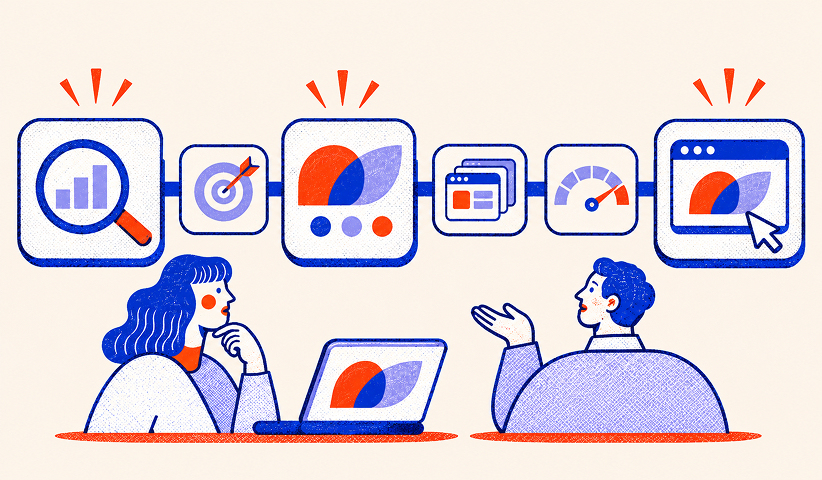


Building the system in the wrong order is the most common reason projects stall. Design work started before strategy is settled gets redone. Guidelines written before templates are tested get ignored. Follow this sequence instead.
Step 1, audit: Inventory live assets and interview channel owners about recurring inconsistencies.
Step 2, align: Confirm positioning and define visual principles that should survive future campaigns.
Step 3, design: Build logo variants, color roles, typography and visual language as one integrated system.
Step 4, operationalize: Create tokens, components and editable channel templates.
Step 5, stress-test: Use the draft system to produce five real assets and fix rules that fail under real content.
Step 6, publish: Release a versioned guide, archive old assets and train the teams who will use it.
For a small or midsize business, a full engagement, from discovery through finished guidelines, typically runs six to twelve weeks. Teams that try to compress this timeline usually skip step one, and pay for it later when the “finished” system doesn’t match how the business actually operates.
Pro Tip: Before finalizing anything, build five real assets in a single sprint, a homepage hero, a feature section, a social carousel, a webinar promo, and a sales one-pager, using only the draft system. If the rules break down or leave gaps on any of the five, fix the system before you write the final guidelines, not after.
How Should You Govern the System as You Scale?
A system that works for a ten-person startup usually breaks somewhere between fifty and two hundred employees, unless governance scales with it. Rules without owners just decay.
Assign one accountable brand-system owner, with web, marketing and sales leads responsible for channel adoption.
Give every token, component and template a version history and a single approved download location.
Require documented approvals for exceptions and an expiration date for temporary deviations.
Review an asset sample each quarter for violations, adoption rates and outdated templates.
Track time-to-publish and repeat review feedback as practical signs of system usefulness.
Skipping governance is the single most common reason a well-designed system falls apart within a year of launch.
How Do You Sequence a Visual Identity Rollout Without Breaking Operations?
Rolling everything out simultaneously feels thorough and creates chaos. Sequence it instead.
Start with a fast audit: list every live asset by channel, flag which ones are highest-traffic, and note which are easiest to fix. Then prioritize:
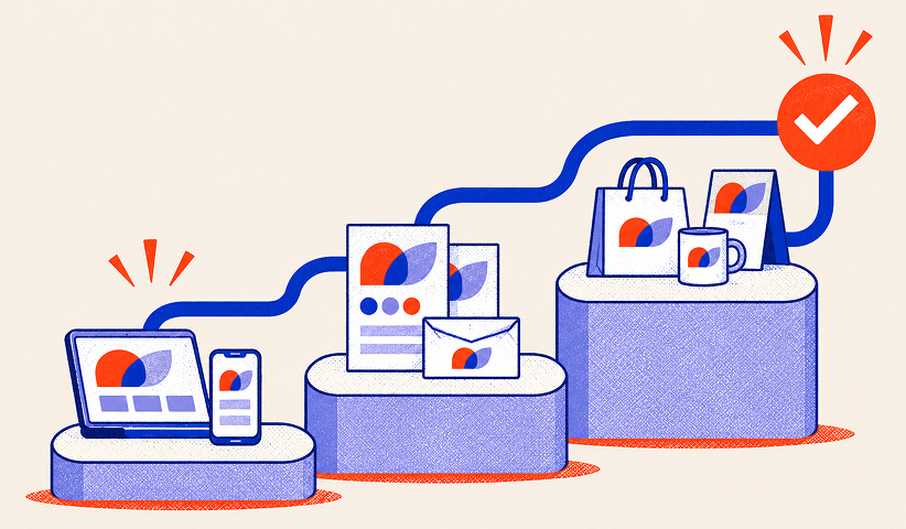
Phase 1: Update the homepage, navigation, most-visited landing pages, paid creative and primary sales deck.
Phase 2: Update recurring social, email, recruitment, webinar and partner templates.
Phase 3: Refresh low-traffic brochures, archived PDFs and internal presentation libraries.
Set a clear coexistence window, a defined date range where old and new assets can both exist, so teams aren’t scrambling to update every file overnight. During rollout, test each priority asset against the practical checks that matter most: how the logo performs at small sizes, whether color contrast passes accessibility standards, and whether the templates still look right once real content replaces placeholder text.
What Do Template Checklists Look Like Across Channels?
Every channel needs its own mini-spec, because a rule that works in a slide deck often fails on a phone screen.
Web: Specify responsive type scales, contrast, buttons, form states, spacing and screenshot treatments.
Social and paid media: Provide platform-safe zones, crop rules, CTA hierarchy and minimum legible sizes.
Email: Include mobile stacking, font fallbacks, dark-mode variants and accessible link styles.
Presentations: Supply grids, chart colors, slide layouts, photo crops and editable components.
Print: Supply CMYK values, bleeds, paper specifications and preflight instructions.
Web deserves its own layer of thinking beyond these basics: component-level styling for buttons, forms, and cards, plus rules for device framing and background treatment in product screenshots, because a website behaves differently than print and needs system-level rules of its own.
Want to learn more about brand platforms, Brand Strategy and Brand Identity? Keep reading!
If you need help with your companies brand strategy and identity, contact us for a free custom quote.
How Does The Branded Agency Approach Visual Identity Work?

Discovery starts with blunt questions: where does the current identity break down, who approves exceptions today, and which channel gets the most complaints internally. Those answers shape the deliverables for each phase, from strategy through guidelines through implementation.
The pitfalls show up in the same three places on almost every project. Vague photography direction that leaves every new photo shoot inconsistent. Missing design tokens, so developers and designers drift apart within months. Unclear ownership, where no one has authority to say no to an off-brand request.
Adoption gets measured with the same practical signals: how much new work pulls from the official library versus getting built from scratch, how many off-brand issues get flagged, and how fast a routine asset moves from brief to published.
Adoption: Percentage of new assets created from current approved templates.
Compliance: Number of high-impact off-brand issues found in quarterly reviews.
Speed: Time from request to approved deliverable, segmented by channel.
Maintenance: Number of active teams and vendors using the latest system release.
What Actually Determines Whether a Visual Identity System Works
Most guidance on this topic treats a visual identity system as a design deliverable: hand over a PDF, call it done. That framing is backwards. The system that survives contact with a real organization is the one built as infrastructure, with tokens, templates, and named owners, not the one with the prettiest brand book.
The conventional advice undersells governance almost every time. Plenty of resources will walk you through choosing a color palette and picking a typeface, and far fewer will tell you that the palette dies within a year without an owner who can enforce it. A system with weaker visuals but a clear approval process consistently outperforms a gorgeous system nobody maintains.
If you take one thing from this guide, make it the one-sprint test: build five real assets across five different channels before finalizing anything. It surfaces the gaps a mood board never will, and it costs a fraction of what redesigning a broken rollout costs six months later. Prioritize that stress test over another round of logo refinement.
Ready to Build a System That Actually Scales?
Most teams don’t fail at visual identity because they lack good taste. They fail because nobody owns the rules once the initial designs ship, and a beautiful brand book with no governance behind it decays within a year. Brand agencies build the whole stack at once, brand strategy, visual design, documented guidelines, and the web implementation to match, so the system you launch with is the one your team is still using two years later.
That matters most for growth-stage companies scaling fast enough that a new hire, a new market, or a new product line can outpace whatever guidelines currently exist. Our branding services cover discovery through governance, and our website development team translates the same system directly into working components, so design tokens don’t die in a PDF nobody opens. If your current identity is more of a loose asset folder than a working system, start with a conversation about what a real rollout looks like for your team.
Frequently Asked Questions

What is the difference between a logo and a visual identity system?
A logo is one recognizable brand asset. A visual identity system defines how that logo works alongside color, typography, imagery, icons, layouts, motion, templates, and usage rules. The system helps different teams create consistent work without making new design decisions every time.
What should a visual identity system include?
At minimum, include primary and alternate logos with clear-space rules, semantic color roles and technical values, a responsive typography scale, photography and illustration direction, iconography, layout and motion principles, editable templates, and a central asset library. Document accessibility, version control, and who can approve exceptions.
How do you create a visual identity system step by step?
Audit existing brand assets and recurring inconsistencies, confirm positioning, design the core visual language, create reusable tokens and templates, and stress-test the draft on real assets. Then publish versioned guidelines, archive outdated files, and train the people who will use the system.
How long does it take to build a visual identity system?
The article uses six to twelve weeks as a typical planning range for a small or midsize business, from discovery to finished guidelines. Actual timing depends on the number of applications, stakeholders, approval rounds, and whether a broader brand strategy needs to be defined first.
How can brand managers prevent visual identity drift?
Assign one accountable system owner, maintain one approved asset library, record version history, and require documented approval for exceptions. Review a sample of live work each quarter and update guidelines when the same mistake repeats across teams or vendors.

Quincy Samycia
As entrepreneurs, they’ve built and scaled their own ventures from zero to millions. They’ve been in the trenches, navigating the chaos of high-growth phases, making the hard calls, and learning firsthand what actually moves the needle. That’s what makes us different—we don’t just “consult,” we know what it takes because we’ve done it ourselves.
Want to learn more about brand platform?
If you need help with your companies brand strategy and identity, contact us for a free custom quote.
We do great work. And get great results.
+2.3xIncrease in revenue YoY
+126%Increase in repurchase rate YoY




+93%Revenue growth in first 90 days
+144% Increase in attributed revenue




+91%Increase in conversion rate
+46%Increase in AOV




+200%Increase in conversion rate
+688%Increase in attributed revenue