Logo Redesigns That Work: A 2026 Guide for Leaders
09/11/2026
Branding
A 2026 guide to logo redesigns — audits, real examples like Apple and Airbnb, common mistakes, and how to choose between a refresh and a full redesign.
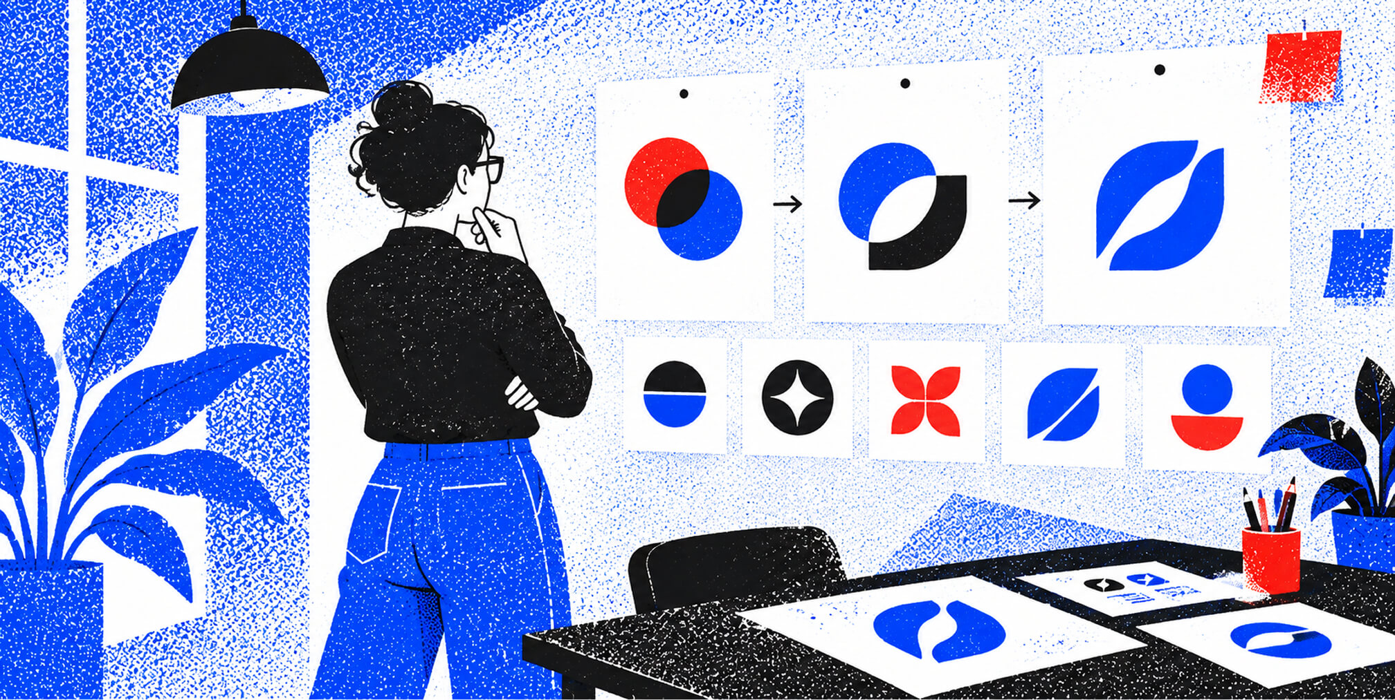
A logo redesign is defined as the deliberate process of updating or replacing a brand mark to better reflect a company's current positioning, audience, and growth ambitions. The industry term for this process is visual identity evolution, and it ranges from a subtle logo refresh to a full brand overhaul. The most successful logo redesigns preserve recognition equity while modernizing design for scalability and market relevance. This guide walks you through the criteria, examples, common mistakes, and best practices that separate costly rebrands from ones that actually move the needle.
.png)


What to Evaluate Before Redesigning, Plus 5 Examples of Evolution Over Revolution
What to evaluate before starting logo redesigns
A comprehensive logo audit is the non-negotiable first step before any design work begins. Skipping this step is the single most common reason redesigns fail to deliver measurable results.
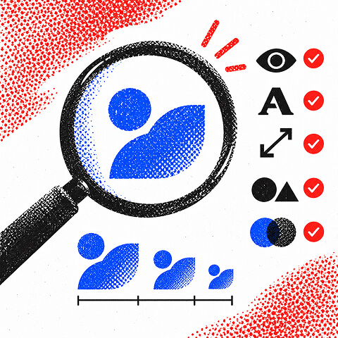
A strong audit covers six core variables: recognition, legibility, consistency, scalability, distinctiveness, and brand fit. Each variable tells you something different about your current mark's health and where it needs work.
Here is what to assess in each area:
- Recognition: Can your audience identify your logo without the brand name attached? High recognition is an asset worth protecting.
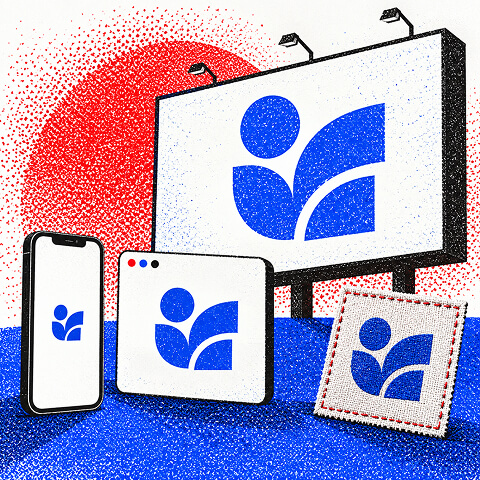
- Legibility: Does the mark read clearly at 16px on a mobile screen and at 10 feet on a billboard? Both extremes matter.
- Scalability: Does the logo hold up in single color, reversed, and embroidered formats? A mark that only works in full color will cost you money across print and merchandise.
- Distinctiveness: Could your logo be mistaken for a competitor in your category? Generic shapes and overused color palettes are red flags.
- Brand fit: Does the visual language still reflect where your company is headed, not just where it started?
Pro Tip: Collect feedback from three groups before you audit: your internal team, your best customers, and people who have never heard of your brand. The gaps between those three perspectives reveal exactly what your logo communicates versus what you intend it to communicate.
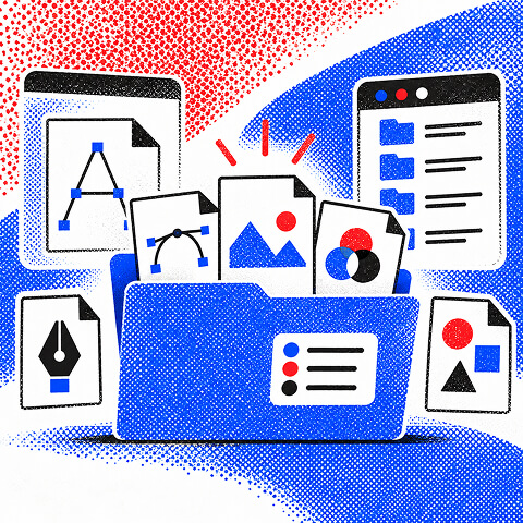
One technical issue that derails many audits: missing original files. Demand original editable vector files in AI, EPS, or SVG format before any redesign begins. Without them, you are starting from scratch at full cost.
| Audit Variable | What to Look For |
|---|---|
| Recognition | Audience identifies mark without brand name |
| Scalability | Works in single color, small sizes, and embroidery |
| Distinctiveness | Not confused with category competitors |
| Brand fit | Reflects current positioning and future direction |
| File quality | Original vector files available and organized |
10 logo redesign examples that show evolution over revolution
The best logo redesign examples in history share one trait: they changed enough to feel current without erasing what made the brand recognizable. The industry calls this "evolution over revolution," and it is the standard that separates admired redesigns from expensive mistakes.
Most admired redesigns evolve typography, simplify details, and refine colors without radical changes. Here are ten examples that illustrate this principle across different industries and scales of change.
1. Apple
Apple's shift from the rainbow-striped apple to a monochrome mark in 1998 is one of the most studied company logo changes in branding history. The shape stayed identical. The color change signaled a new era without abandoning recognition built over two decades.
2. Google
Google's 2015 move from a serif to a custom sans-serif wordmark modernized the brand for mobile screens. The four core colors stayed in place. That continuity kept global recognition intact while the new typeface improved legibility at small sizes.
3. FedEx
FedEx's 1994 redesign by Landor Associates introduced the now-famous hidden arrow between the "E" and "x." The mark looked clean and simple on the surface. The embedded symbol added a layer of meaning that rewarded attention and became a case study in clever visual identity design.
4. Starbucks
Starbucks removed its wordmark in 2011, leaving only the Siren icon. That decision only works when brand recognition is already near-universal. For most entrepreneurs, removing the name too early destroys the recognition equity you have spent years building.
5. Pepsi
Pepsi's 2023 redesign returned to a bolder, more retro-inspired wordmark after years of minimalism. The move shows that redesigns are not always about going simpler. Sometimes the right direction is reclaiming visual weight that was lost in previous iterations.
Free Brand Health Audit
Make sure your brand is built to sell
Search has changed. Your customers aren't just Googling anymore. They're asking ChatGPT, Perplexity, Gemini and other AI platforms what to buy, who to trust and which brands they should consider.
If your brand isn't showing up clearly in those answers, you're already losing opportunities. Our free Brand Health Audit shows you where your brand stands across traditional search, AI search and brand positioning.

Sample brand audit
Live preview
Traditional search
72
AI search (GEO)
34
Brand positioning
58
5 More Redesign Examples, and the Most Common Mistakes Entrepreneurs Make
6. Mastercard
Mastercard dropped its wordmark from the overlapping circles in 2019. The two interlocking circles had enough global recognition to stand alone. This is a textbook example of a brand earning the right to simplify through decades of consistent application.
7. Airbnb
Airbnb's 2014 "Bélo" symbol replaced a generic wordmark with a custom icon representing belonging. The redesign aligned the visual identity with a repositioned brand story. It is one of the clearest examples of a logo change driven by a genuine strategic shift, not aesthetics alone.
8. Gap (cautionary example)
Gap's 2010 redesign lasted six days before the company reverted to its original blue box. The new logo was introduced with no customer research and no rollout plan. Surprising customers with sudden logo changes without communication creates backlash that no design quality can overcome.
9. Instagram
Instagram's 2016 shift from a skeuomorphic camera to a flat gradient icon was polarizing at launch. Within weeks, the new mark became the standard visual shorthand for the platform. The lesson: bold changes can succeed when the product experience reinforces the new identity.
10. Burger King
Burger King's 2021 return to its 1969-era retro logo is one of the best logo redesigns of the past decade. The move proved that going backward can be a forward-looking decision when the original mark is stronger than what replaced it.
Common mistakes entrepreneurs make when redesigning logos
The most damaging redesign mistake is changing a logo because you are bored with it. Recognition is an asset to protect, not a liability to escape. Familiarity with your audience has real monetary value, and erasing it without cause is a strategic error.
Here are the most frequent pitfalls and how to avoid them:
- Redesigning without a clear business reason. A logo change should be triggered by a business event: a pivot, a merger, an audience shift, or a significant product expansion. Aesthetics alone are not a reason.
- Ignoring technical file requirements. Many entrepreneurs neglect securing vector master files, which forces expensive rework when scaling to new formats or merchandise.
- Surprising your audience. No communication plan means no context for the change. Customers interpret sudden visual shifts as instability, not progress.
- Losing key brand elements. Color, shape, and typographic style carry recognition equity. Changing all three at once resets your brand to zero in the market's memory.
- Skipping stakeholder alignment. Internal teams, sales partners, and key customers should see the direction before launch. Their feedback catches problems that internal teams miss.
Pro Tip: Build a rebranding mistakes checklist before your first design brief is written. Identifying what you will not change is as important as deciding what you will.
The Gap example is the clearest warning in modern branding. A rushed redesign with no research and no rollout plan cost the company significant brand equity and public credibility in less than a week.
Weighing a logo refresh against a full redesign? Keep reading!
If you need a clear-eyed audit before you commit to either path, contact us for a free custom quote.
The 7-Step Rollout Framework, and Choosing Between a Refresh and a Full Redesign
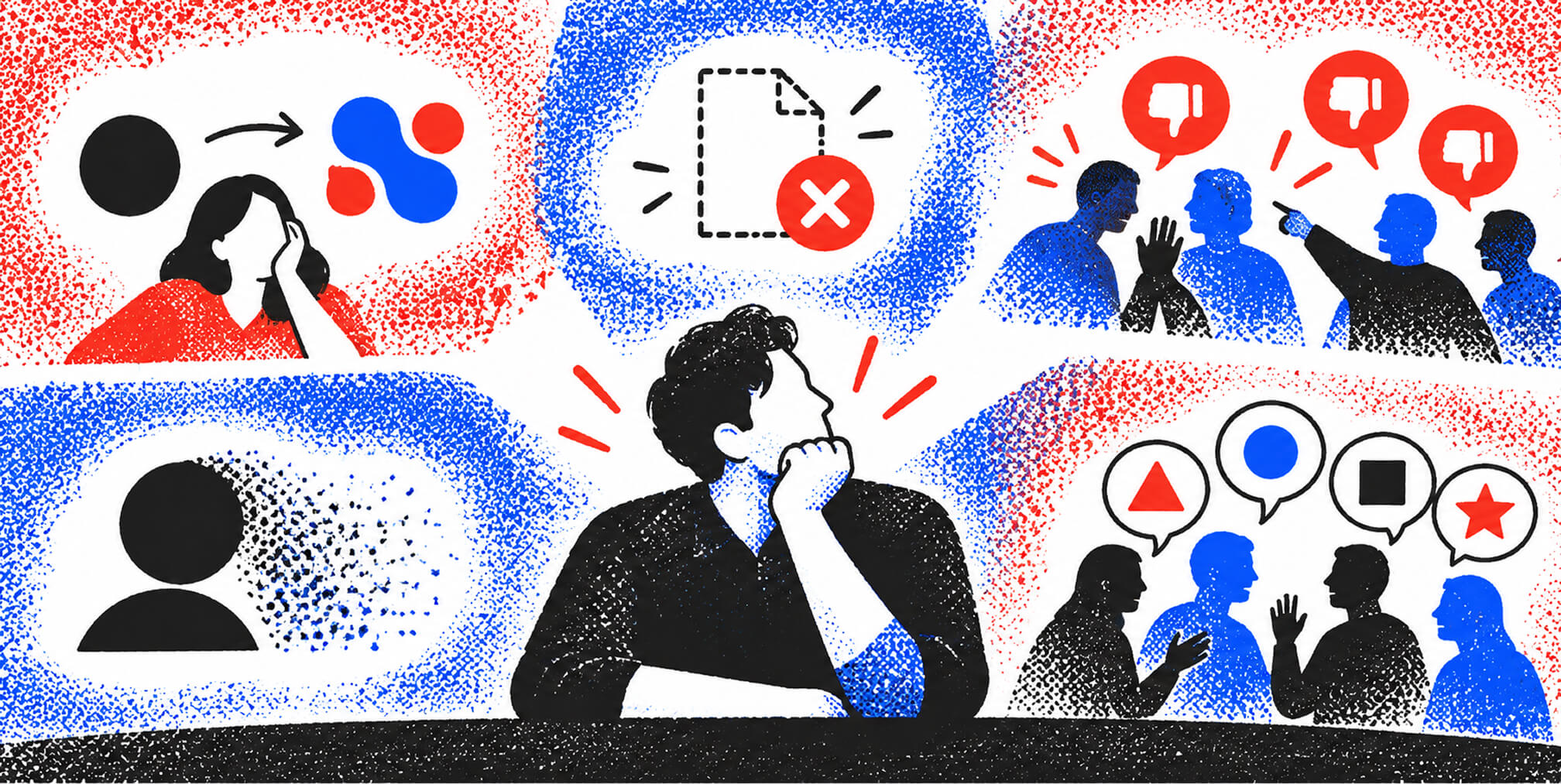
Best practices for planning, designing, and rolling out a logo redesign
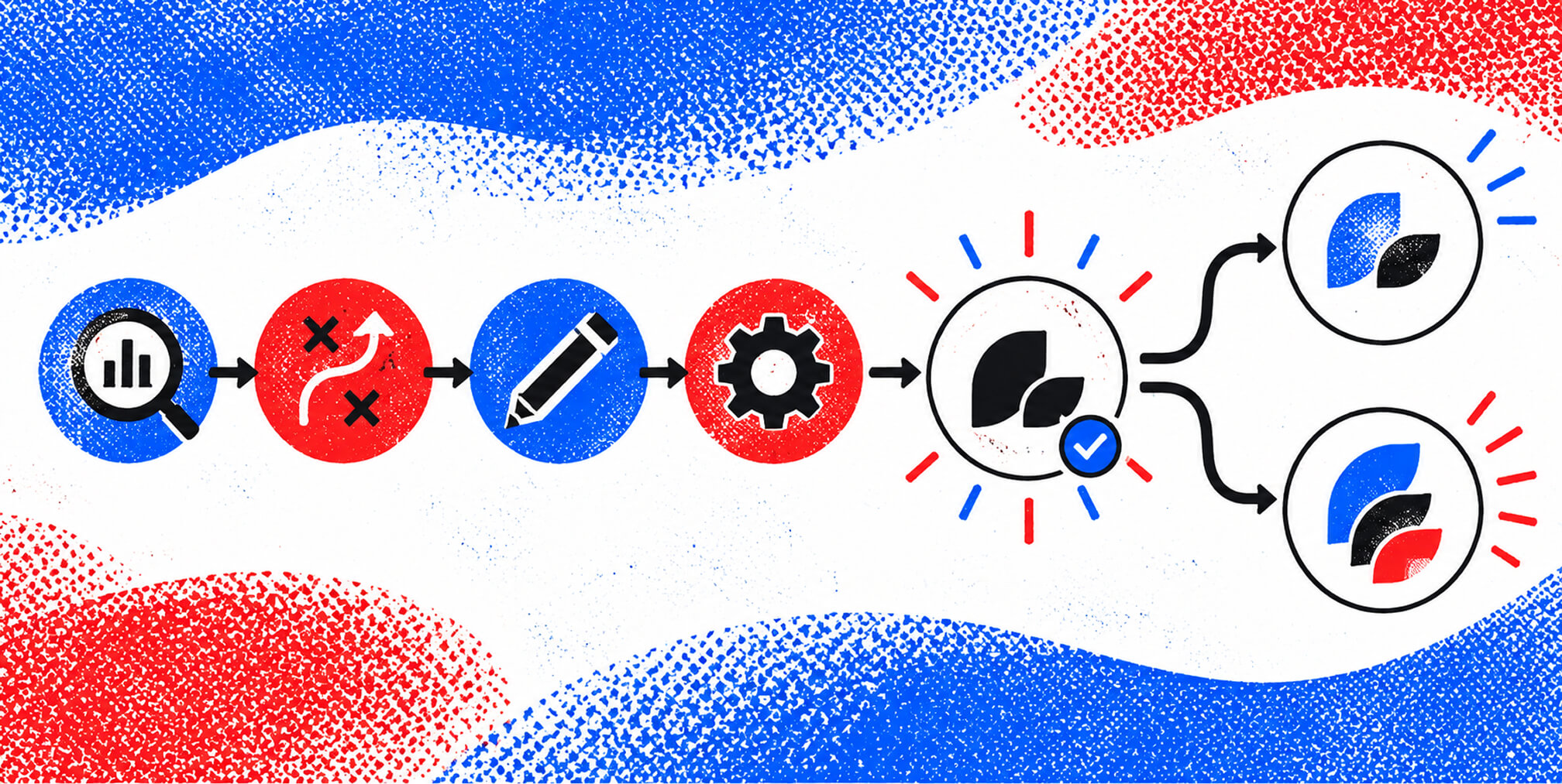
Effective rebrands follow a fixed sequence: Audit, Strategy, Design, Rollout. Skipping any stage produces results that are misaligned with business goals and expensive to fix.
Here is the framework that produces consistent results:
- Audit your current logo and brand assets. Document every version of your logo in use across digital, print, and merchandise. Identify which files are vector and which are not.
- Define the strategic brief. Write down why the change is happening, what must be preserved, and what success looks like. This brief governs every design decision that follows.
- Develop the new mark with a visual identity system. A logo does not exist in isolation. Logo branding guidelines should cover color palettes, typography, spacing rules, and approved variations from day one.
- Test across every format. Check the mark at 16px, 500px, and billboard scale. Test in black and white, reversed on dark backgrounds, and embroidered on fabric. Failures at this stage are cheap. Failures after launch are not.
- Coordinate a phased rollout. A 30-60-90 day rollout plan covering templates, training, and governance prevents inconsistent application across channels.
- Communicate the change proactively. Tell your audience why the mark is evolving. A clear narrative reduces confusion and builds goodwill. Learning how to announce a rebrand without losing customers is a skill worth developing before launch day.
- Set governance for future use. Define who approves logo usage, what variations are permitted, and how the mark will be reviewed in the future. Without governance, brand consistency erodes within 12 months.
Rollout plans should cover templates, rules, training, and governance to avoid inconsistent branding across teams and markets. Consistency is what turns a new logo into a recognized brand asset. If your redesign is part of a broader site overhaul, our website redesign guide covers how to budget and sequence that larger project alongside your visual identity work.
How to choose between a logo refresh and a full redesign
A logo refresh is a minor update that preserves the existing mark's structure while improving legibility, color accuracy, or typographic weight. A full redesign replaces the mark's core concept, shape, or visual language entirely.
| Factor | Logo Refresh | Full Redesign |
|---|---|---|
| Brand recognition | High, worth preserving | Low or actively hurting growth |
| Business trigger | Minor modernization needed | Pivot, merger, or audience shift |
| Timeline | 4-8 weeks | 3-6 months |
| Budget impact | Lower | Higher, includes full rollout costs |
| Risk level | Low | Higher, requires communication plan |
Choose a refresh when your mark is recognizable but feels dated. Choose a full redesign when the business has fundamentally changed and the current logo no longer reflects what you do or who you serve.
Signs a refresh is enough:
- Your logo is recognized by your core audience but looks poor on digital platforms.
- The typography is outdated but the icon or symbol still works.
- Color values are inconsistent across files but the palette concept is sound.
Signs a full redesign is necessary:
- Your company has entered a new market or acquired a business with a different audience.
- The current mark carries negative associations from a past brand crisis.
- Your product offering has expanded so significantly that the original logo no longer represents the full scope.
Budget 3-6 months and costs for design plus rollout collateral to fully realize the benefits of a full redesign. Underestimating the rollout budget is the most common financial mistake in the process.
Key Takeaways, What I've Learned, How The Branded Agency Helps, and FAQ
Key Takeaways
Successful logo redesigns protect recognition equity first and update aesthetics second, following a disciplined sequence of audit, strategy, design, and rollout.
| Point | Details |
|---|---|
| Audit before designing | Evaluate recognition, scalability, distinctiveness, and file quality before any design work starts. |
| Evolution beats revolution | The best redesigns update typography and color without replacing what audiences already recognize. |
| Communication prevents backlash | Proactive messaging about why the logo is changing reduces customer confusion and negative reactions. |
| Secure vector files | Always obtain original AI, EPS, or SVG files to avoid forced rework when scaling assets. |
| Governance sustains consistency | Define approval rules and usage standards at launch to protect brand integrity long term. |
What I have learned from watching brands get this wrong
After working through dozens of brand identity projects, the pattern I see most often is this: entrepreneurs treat the logo as the problem when the real issue is the strategy underneath it. They commission a new mark, love it in the presentation, and then watch it underperform because nothing else changed. The logo is not the brand. It is the brand's signature.
The brands that get redesigns right treat the logo as the last decision, not the first. They spend weeks on positioning, audience research, and competitive analysis before a single design concept is sketched. By the time the mark is finalized, it is almost inevitable because every strategic decision has already pointed toward it.
The other thing I have seen consistently: entrepreneurs underestimate how much their team's buy-in matters. A new logo that the sales team does not understand or believe in gets applied inconsistently, explained poorly to customers, and quietly abandoned within a year. Internal alignment is not a soft concern. It is a hard business requirement.
My honest recommendation is to resist the urge to redesign when you are feeling restless about your brand. Boredom is not a business reason. If you cannot articulate the specific market problem the new logo solves, you are not ready to redesign yet. Wait until the strategic case is clear. Then move fast and commit fully.
— Quincy Samycia
How The Branded Agency supports your brand evolution
A logo redesign is only as strong as the strategy and execution behind it. The Branded Agency works with growth-stage companies and ambitious entrepreneurs to build executive-level branding that goes beyond aesthetics and into measurable market impact.
Our team handles every stage of the process: brand audits, visual identity development, logo design, rollout planning, and governance frameworks. We align your new mark with your positioning, your digital platforms, and your performance marketing so the investment compounds across every channel. If you are weighing a refresh against a full redesign and want a clear-eyed assessment of what your brand actually needs, we are ready to work through it with you.
FAQ
What triggers a logo redesign? A logo redesign is triggered by a business event such as a company pivot, merger, audience shift, or significant product expansion. Redesigning for aesthetic reasons alone without a clear strategic rationale risks erasing recognition equity.
How long does a logo redesign take? A logo refresh typically takes 4-8 weeks. A full redesign, including rollout planning and asset production, requires 3-6 months to execute properly.
What files should I receive from a logo designer? Always request original editable vector files in AI, EPS, and SVG formats. These formats allow scaling to any size without quality loss and prevent costly rework later.
What is the difference between a logo refresh and a full redesign? A refresh updates minor elements like typography weight or color accuracy while preserving the mark's core structure. A full redesign replaces the concept, shape, or visual language of the existing logo entirely.
How do I avoid customer backlash when logos change? Communicate the reason for the change before the new mark goes live. A proactive narrative that explains the business rationale reduces confusion and builds goodwill with your existing audience.
Recommended

Quincy Samycia
As entrepreneurs, they’ve built and scaled their own ventures from zero to millions. They’ve been in the trenches, navigating the chaos of high-growth phases, making the hard calls, and learning firsthand what actually moves the needle. That’s what makes us different—we don’t just “consult,” we know what it takes because we’ve done it ourselves.
Want to learn more about brand platform?
If you need help with your companies brand strategy and identity, contact us for a free custom quote.
We do great work. And get great results.
+2.3xIncrease in revenue YoY
+126%Increase in repurchase rate YoY



+93%Revenue growth in first 90 days
+144% Increase in attributed revenue




+91%Increase in conversion rate
+46%Increase in AOV

+200%Increase in conversion rate
+688%Increase in attributed revenue